
GL.iNet Brand Site
Full Desktop Prototype
Full Mobile Prototype
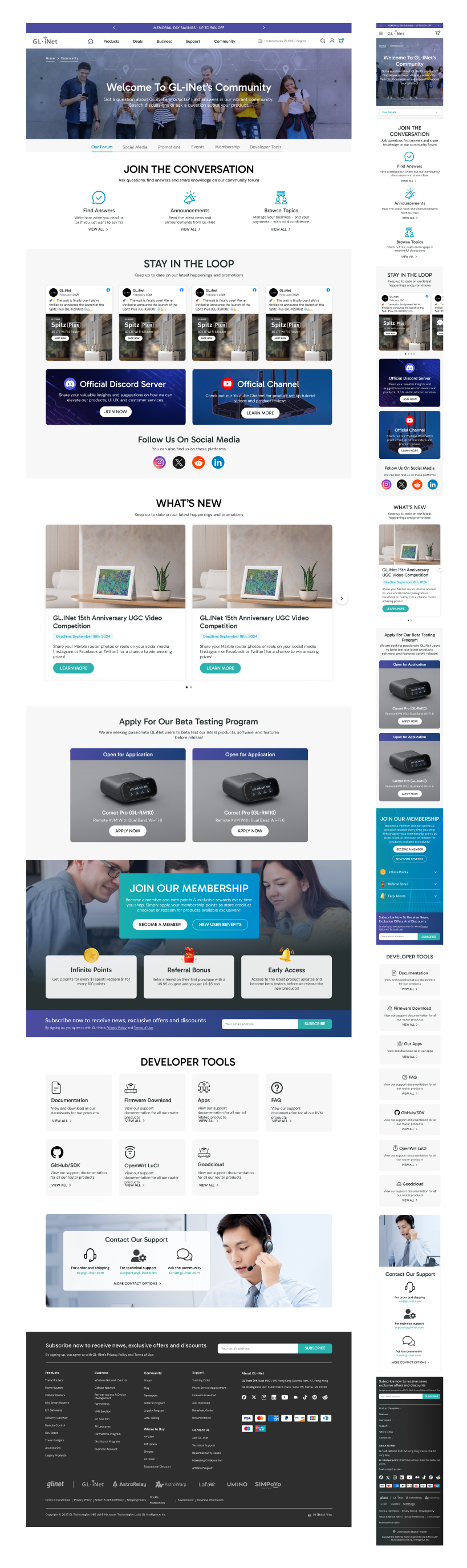
Homepage
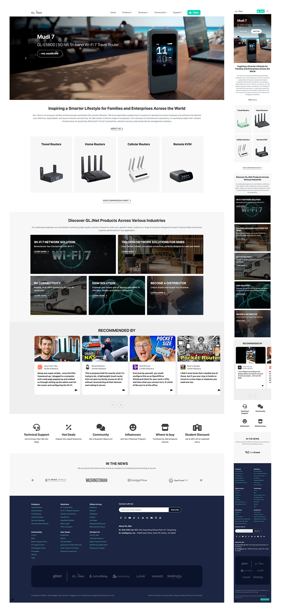
Old Design
The original brand site homepage was quite plainm it served a functional purpose but failed to convey GL.iNets brand identity or differentiate the company from competitors. Unlike the ecommerce site (which is constrained by Shopify templates), the brand site offered more freedom for creative expression, however the original design didn't capitalize on this opportunity.
Key Issues
Plain and uninspiring: Lacked visual impact and brand personality
B2B section unclear: B2C and B2B users both struggled to find their entry point
Underutilized visuals: Missed opportunity to showcase products and solutions
Weak community and membership presence: Reduced to small icons with no context
Limited content visibility: Service areas, apps, and news were difficult to identify
Before
After
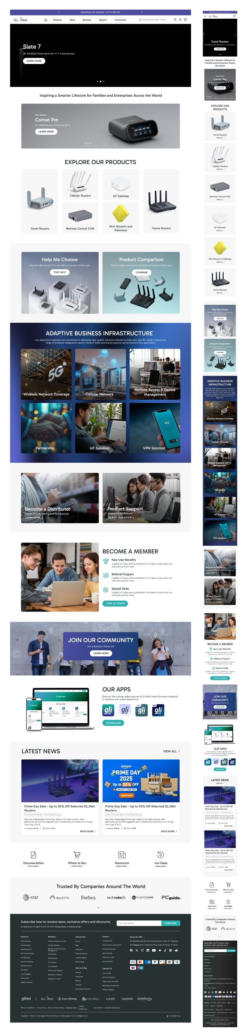
New Design
1. Stronger Branding & Visual Expression
The brand site allowed for more creative freedom than the ecommerce store, so I used this to inject stronger branding elements—making the page feel premium, modern, and distinctly GL.iNet. The brand site is often the first touchpoint for B2B buyers, partners, and media, so a premium, polished design is vital.
2. Clear User Pathways: B2C + B2B
The homepage now serves both B2C and B2B users with clear, distinct entry points and positions GL.iNet as both consumer-friendly and enterprise-ready. The first part of the page was aimed towards B2C users and guides users naturally from brand awareness to specific product exploration. I also added prominent access to both the "Help Me Choose" tool (for users who need guidance) and the "Product Comparison" tool (for technical users who want to compare specs). The second part showcases their 6 major enterprise solutions and highlights their Distributor program.
3. Visual Emphasis & Modern Spacing
I expanded the use of white space for a more spacious layout to create a cleaner, more premium feel. I also included more visuals and color to make it more appealing and the branding stand out more.
4. Service Areas (B2B Solutions)
While the original design made it difficult to identify GL.iNet's enterprise offerings, the new design features six service areas prominently and highlights their Distributor program—ensuring B2B users see the full scope of GL.iNet's solutions immediately.
5. Expanded Community, Membership & News
In the original design, community and membership were reduced to small icons. I expanded these into dedicated, content-rich sections that communicate value. I also added additional content, such as an Apps section and Latest News.
The brand site is GL.iNet's digital storefront, where first impressions are formed and where B2B partnerships begin. Unlike the e-commerce site, which is focused on transactions, the brand site needs to tell a story: who GL.iNet is, what they stand for, and why you should work with them. By injecting stronger branding, creating clear pathways for B2C and B2B users, and expanding community and membership sections from mere icons into compelling content, I transformed the brand site into a premium, conversion-oriented asset—one that serves both individual buyers and enterprise partners.
Support Center
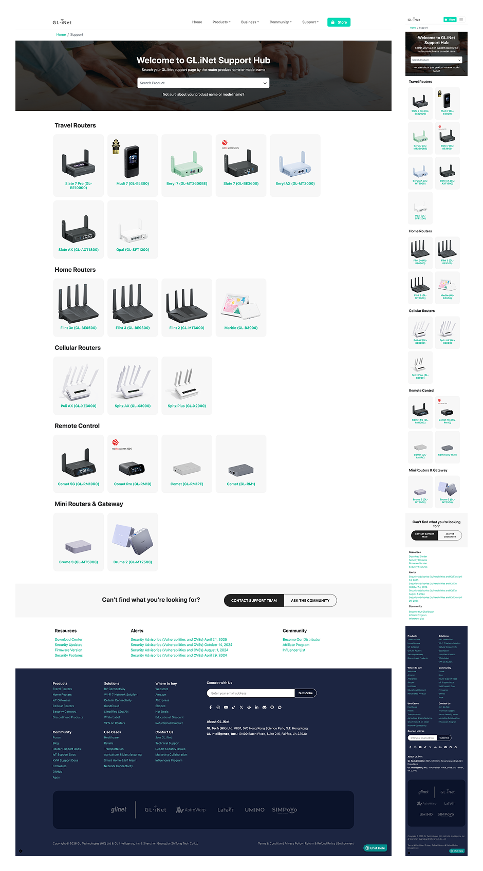
Old Design
The original support page functioned as a simple product list—it showed available products but provided no guidance on where to find help, documentation, or community support. The list-based format was easily overlooked and didn't serve users who needed specific resources.
Key Issue
List-based format: Easy to overlook and felt like an afterthought
Product-only focus: No visibility into other support resources (docs, firmware, community)
No clear entry points: Users didn't know where to go for help beyond product selection
Before
After
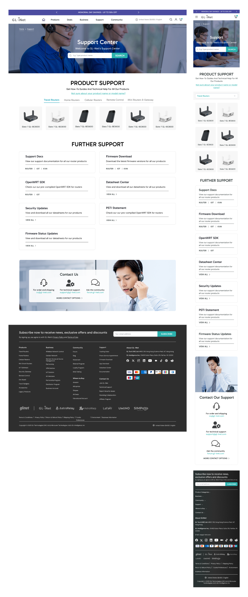
New Design
1. Comprehensive Support Center Structure
I expanded the page to highlight all available support resources and not just product support. The support center now serves as a true hub where users can access documentation, firmware downloads, community forums, and direct support. I also transformed the old list-based format into a card-based grid with clear visual hierarchy, allowing technical users to quickly identify the resource they need
2. Product Categories: From Vertical List to Compact Tabs
As GL.iNet's product lineup grows, a vertical list of products becomes increasingly difficult to navigate. The support page needs to scale without becoming overwhelming. Hence, I turned it into a more compact layout using category tabs, which allow users to quickly filter by product category rather than scrolling through an ever-growing list.
3. Mobile Optimization
The card-based grid adapts seamlessly to mobile screens, maintaining scannability without requiring horizontal scrolling or excessive zooming.
4. Clear Documentation & Community-Driven Support
I added clear pathways to product manuals, hardware specs, and user guides—ensuring users can find detailed documentation without digging through multiple pages. I also highlighted community-driven support options (forums, user guides, community posts) alongside official documentation. This is because community-driven support is often the first stop as users trust peer recommendations and real-world solutions. Making community resources prominent alongside official docs signals that GL.iNet values and supports its user community.
A support center is often the most visited page on a technical product site yet it's frequently treated as an afterthought. Users arrive already frustrated and a poorly designed support page only adds to that frustration. By replacing a text-heavy list with an organized, scannable card-based grid, adding category tabs to handle product growth, and elevating both official documentation and community resources, I transformed the support page into a true resource hub—one that helps users find solutions quickly and builds trust in the brand.
Community Page
Old Design
The original community page was functional but plain and impersonal—it listed resources without creating a sense of connection or belonging. For a brand like GL.iNet, where community engagement is a key differentiator, this was a missed opportunity.
Key Issues
Static and uninspiring: Felt more like a directory than a community hub
Limited engagement opportunities: No social proof, no recent activity, no reason to return
No visibility into events or promotions: Users couldn't see what was happening
Fragmented resources: Forums, membership, and developer tools existed but weren't presented cohesively
BEFORE
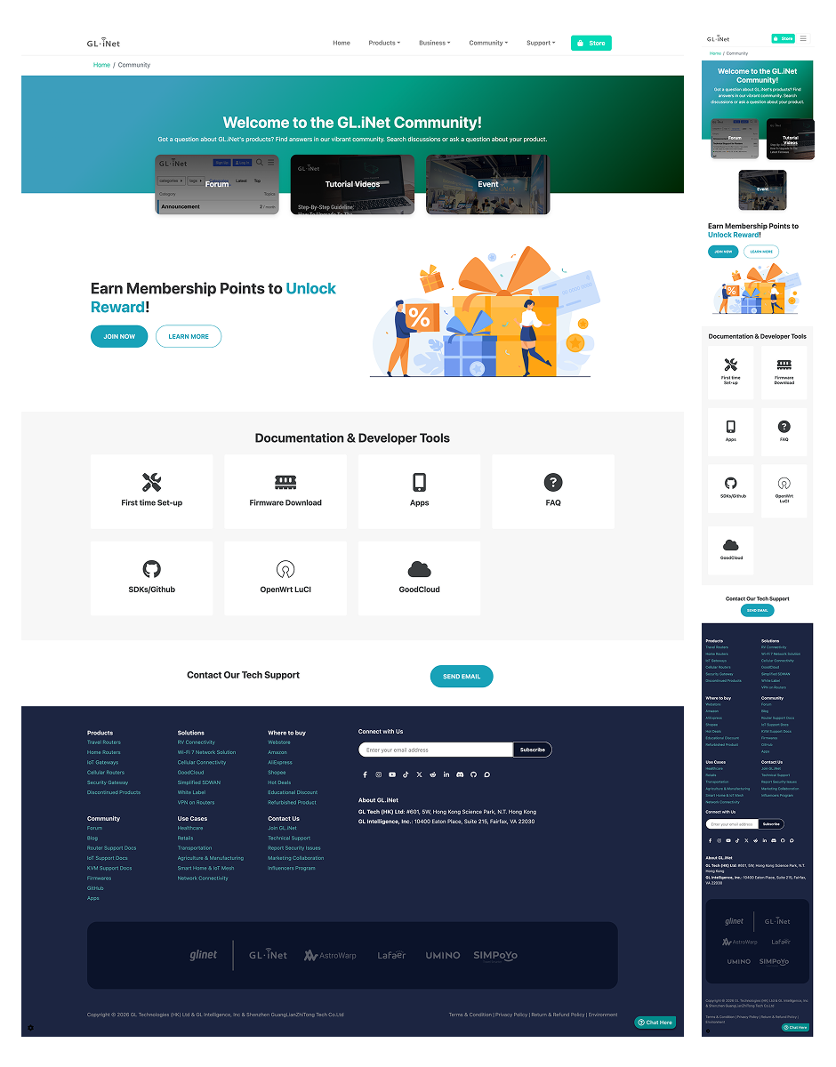
Mobile
AFTER
New Design
1. Dynamic Content to Foster Engagement
I added live social media feeds to showcase real-time community activity and user-generated content. This provides social proof and potential community members can see that GL.iNet has an active, engaged audience. I also added a dedicated section for upcoming events (webinars, product launches) and time-sensitive promotions. This creates urgency and gives users a reason to check back regularly. Additionally, I highlighted the beta testing program to give users a tangible way to contribute. For technical audiences, being part of product development is a powerful engagement driver and builds brand loyalty. A community page that never changes feels abandoned. Dynamic content (feeds, events, promotions) signals that the community is active, valued, and worth participating in.
2. Horizontal Tabs for Easy Navigation
To prevent the page from becoming overwhelming (and to help users quickly jump to the content they need), I added sticky horizontal tabs at the top as the primary navigation mechanism.
3. Expanded Content: Forums & Membership
I expanded the forum section with clear context, explaining what the forums are, who they're for, and how to get involved. Rather than a bare list of links, users now understand the value of participating. I also highlighted the member benefits like points, discounts, early access, and exclusive content, so the membership section now clearly communicates the value of joining.
4. Developer Tools for Technical Users
I expanded the developer resources section to provide easier access to technical resources and serve their needs more comprehensively.
5. Comprehensive Customer Support & Email Subscription
I added a dedicated support section with quick links to documentation, help center, and direct support contact. This ensures users can get help without leaving the community page. I also added an email sign-up for community updates, ensuring users stay connected even when they're not actively browsing.
Users need to see that the community is active, that there are opportunities to participate, and that there's value in joining. By adding dynamic content (social feeds, events, beta testing), clarifying value propositions (membership, forums), and organizing everything with intuitive tabs, I transformed the community page from a directory into an engaging living hub, one that serves both casual users and the brand's core technical audience."
Newsroom
Old Design
GL-iNet’s media content was scattered across separate pages and lacked cohesive presentation.
Key Issues
Fragmented resources: Press kit and influencer program lived on separate pages
Incomplete media coverage: Only logos were shown, no supporting articles or context
Before
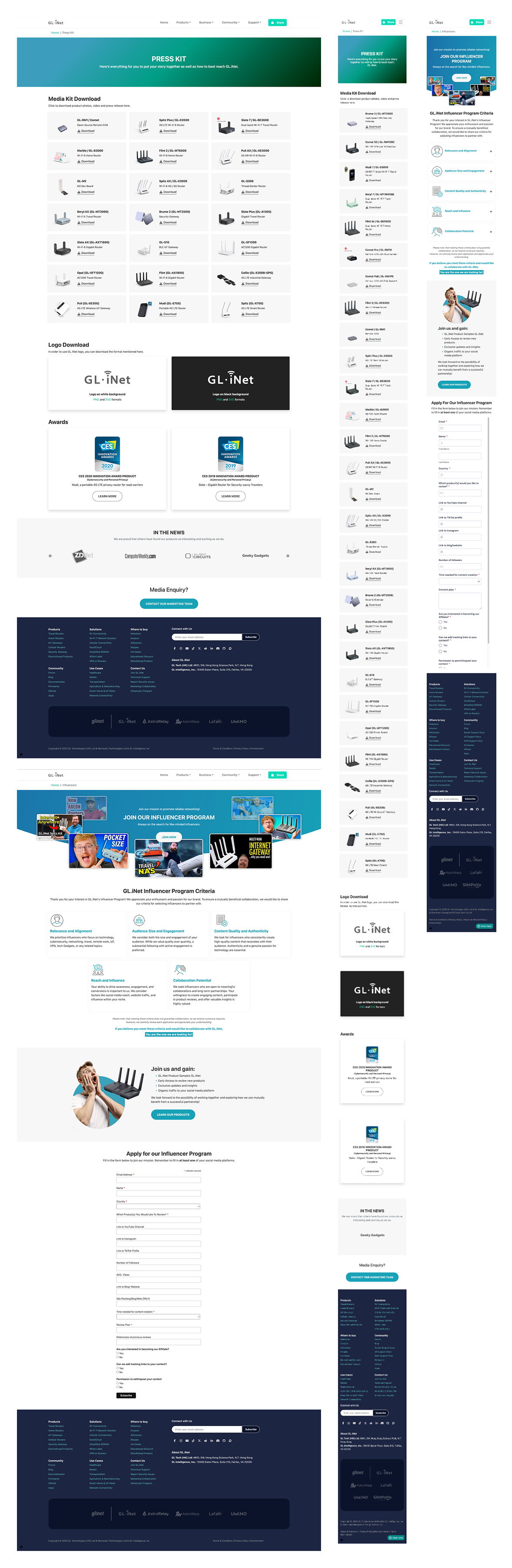
AFTER
New Design
1. Consolidated Newsroom Structure
GL.iNet wanted to unify related but previously separate resources into a single, comprehensive newsroom page. This includes Press Kit + Influencer Program + Media Coverage + Blogs. This reduces friction for users who need to access multiple types of content and presents a more professional brand image.
2. Horizontal Tabs for Easy Navigation
Similar to the community page, I added horizontal tabs at the top to help users quickly navigate to the content they care about.
3. Influencer Program: Featured Content & Streamlined Application
I added a prominent featured post from a collaborator to showcase real influencer collaborations. This provides social proof and potential influencers can see the quality of work GL.iNet produces with partners. I also added visual examples of other collaborators to demonstrate the program's reach and credibility. Furthermore, rather than requiring users to scroll through a lengthy application form, I made it an expandable element so they can click to reveal the form only when ready.
4. Expanded "In the News" Section
The original "In the News" section displayed only logos of media outlets. However, a logo alone doesn't convey the quality or relevance of media coverage. Hence I expanded this to include actual article excerpts, publication names, dates, and links to the full pieces. Showing actual article excerpts and dates provides deeper credibility and people can see that GL.iNet has been featured in meaningful, recent coverage.
5. Press Kit: Searchable & Compact
The client mentioned they didn't want to highlight the content in the original press kit page. The content existed but wasn't a focus area. So I moved the press kit to the end of the page and made it a searchable element rather than displaying all assets at once, to prevent the page becoming too long.
By consolidating fragmented resources into a tabbed, scannable hub with featured influencer content, detailed media coverage, and a searchable press kit, I transformed the newsroom into a centralized media hub that functions as a strategic credibility tool.