
GL.iNet E-commerce Site
Full Desktop Prototype
Full Mobile Prototype
Homepage
Old Design
The original e-commerce homepage suffered from several critical UX issues that hindered product discovery and conversion. The result was a homepage that confused rather than guided—particularly problematic for GL.iNet's research-driven, technical audience who arrive with specific needs in mind.
Key Issues
No clear point of focus: The page lacked a visual anchor and users didn't know where to look first
Repetitive content: Product categories were repeated multiple times without purpose
Unclear text hierarchy: No standardized font sizes or clear titles—everything looked equally important
Outdated design elements: Text overlays on photos made content difficult to read
Before
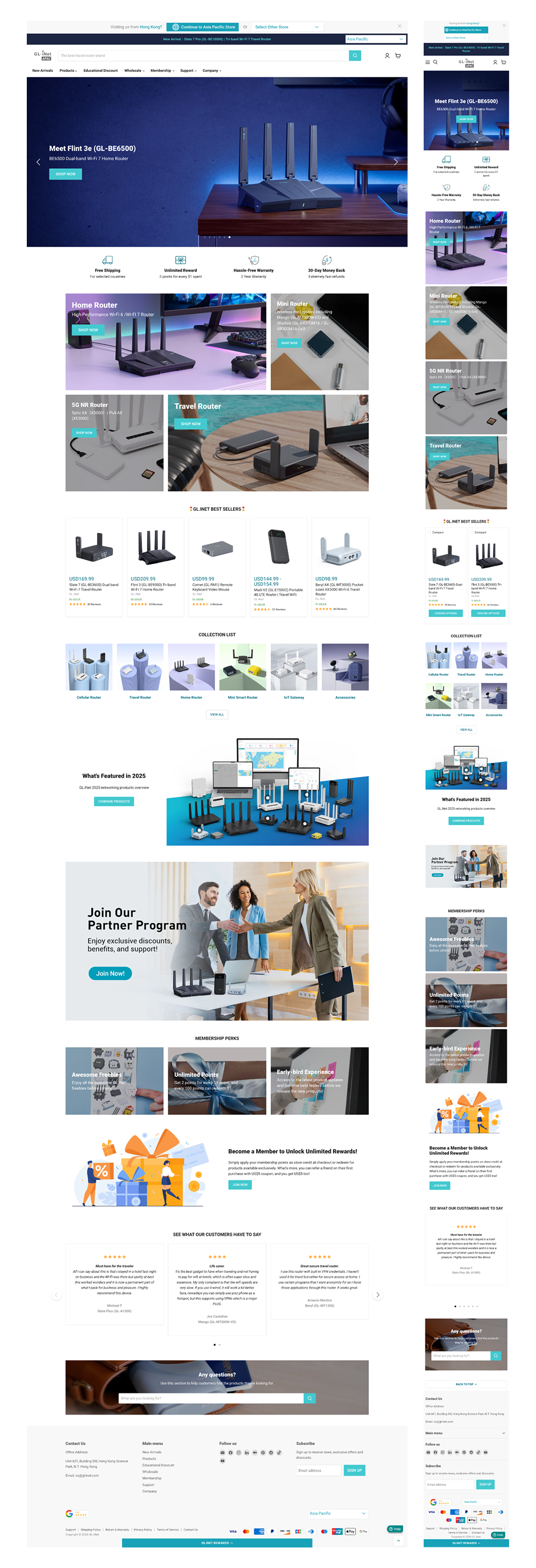
After
New Design
1. Clear Visual Hierarchy & Scannable Layout
Research shows that technical buyers know exactly what they want. A user looking for a travel router doesn't want to scroll through home routers to find it, so making categories immediately visible reduces cognitive load and accelerates the path to purchase.
With the Tab + Slider Component, users can toggle between "Best Sellers" (popularity), "Best Deals" (discounts), and "New Arrivals" (newness) within the same module, enabling efficient filtering without a page reload. Each tab appeals to a different shopper motivation: "Best Sellers" = trust/social proof; "Best Deals" = value-seeking; "New Arrivals" = curiosity/innovation.
2. Visual Distinction & Brand Expression
To make the category section more dynamic and visually interesting, product images extend beyond their card boundaries. This subtle design treatment adds depth and captures attention without overwhelming the layout.
Also, the old product photo backgrounds made the category section look cluttered and inconsistent. The new uniform grey background (from the style guide's neutral palette) creates visual consistency, reduces noise and ensures products remain the focal point.
3. Trust Signals & Community Engagement
I added visual trust signals including customer reviews, community spotlights, and user-generated content reinforces credibility. For technical buyers, peer validation is often more persuasive than marketing copy.
The membership section is enhanced with more visuals and prominent CTAs to encourage loyalty program sign-ups and now stands out as a distinct value proposition rather than a subtle afterthought.
I also added dedicated support content like user guides, documentation links, and customer support access to reinforce trust and confidence. For technical products, easy access to support resources signals reliability and reduces post-purchase anxiety.
4. Mobile Optimization
For mobile, we wanted to condense the content so we utilized accordion-style expandable sections and removed some images to reduce scrolling and improve load times.
The homepage serves as both a marketing showcase and a navigation hub. The goal is to get them to the right product as efficiently as possible, while building enough trust and brand affinity to convert them.
Product Page
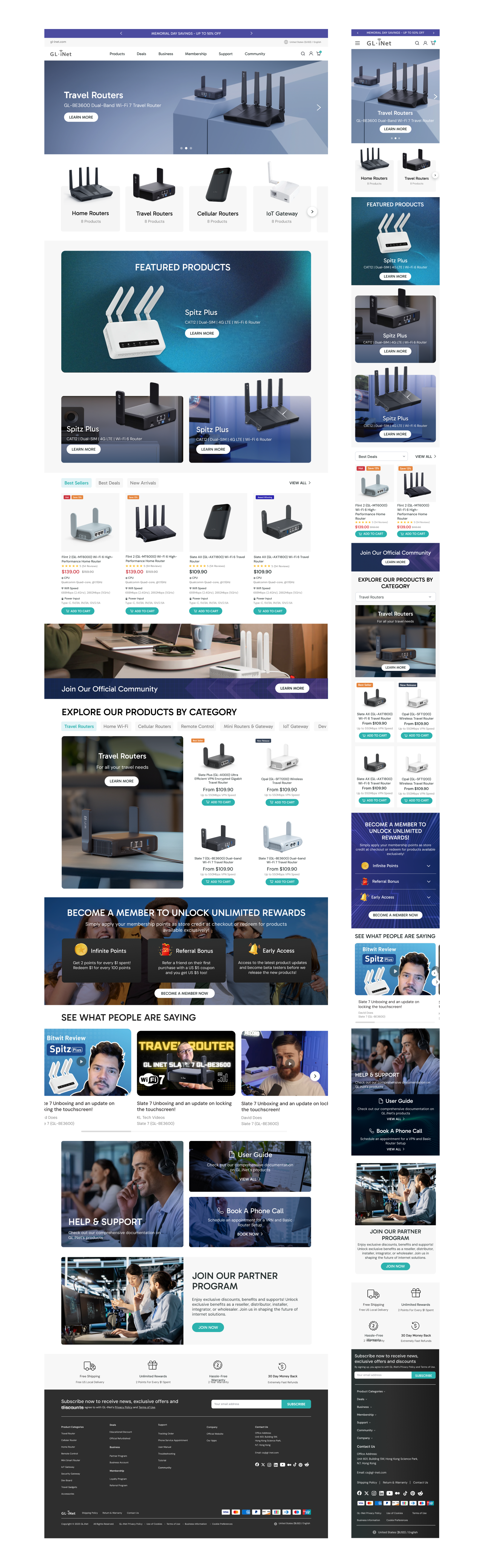
Old Design
The original product page suffered from several critical UX and performance issues that hindered conversion.
For GL.iNet's research-driven and technical audience, this was particularly problematic. These users arrive ready to evaluate specifications and make informed decisions—but the old page made that evaluation unnecessarily difficult.
Key Issues
Poor optimization with animated elements: This caused slow load times and users abandoned before the page fully rendered
Excessive scrolling required: Key information buried deep below the fold
Overwhelming, unstructured product information: Users couldn't quickly find what they needed
Before
After
The New Design
1. Above-the-Fold Optimization
The first section is now optimized to show product imagery, key information and the primary CTA immediately without scrolling. The full specs are also available below the product images, so users can see comprehensive specifications at first glance with no scrolling required to find detailed technical data.
2. Ecommerce Optimization Elements
I added a range of conversion-focused features to reduce friction and build confidence, like a sticky cart, estimated delivery date, buyer incentives and payment options. These features build trust and transparency and reduce purchase anxiety. Users can evaluate not just the product specs, but the entire buying experience.
3. Standardized Modular Layout
I opted for a clean, modular grid design and a standardized layout that makes it easy to maintain consistency across different products.
4. Sticky Horizontal Tabs
Adding sticky horizontal tabs allows users to quickly jump to the information they want without endless scrolling and makes for easier navigation for long pages.
5. Mobile Optimization
Horizontal scrolling for tabs on mobile devices creates a poor user experience as users would have to swipe back and forth to find content. After discussion with GL.iNet, I implemented a dropdown layout for mobile tabs.
For GL.iNet's audience, the product page is the most critical touchpoint in the purchase journey. The goal was to get them the information they need as efficiently as possible, while building enough confidence to convert. Every decision from above-the-fold optimization to mobile-friendly tabs was made for the dual purpose of efficiency and trust.
Loyalty Program
Old Design
The original loyalty program page was functional but uninspiring. It communicated the mechanics of the rewards system without making the value proposition compelling enough to drive sign-ups as effectively as it could.
Key Issues
Basic, utilitarian presentation: Listed rewards without building excitement
Limited contextual information: No mention of new user benefits, member-exclusive discounts, or the full value of joining
Weak visual appeal: Felt disconnected from the rest of the site and didn't make the program feel valuable or exclusive
BEFORE
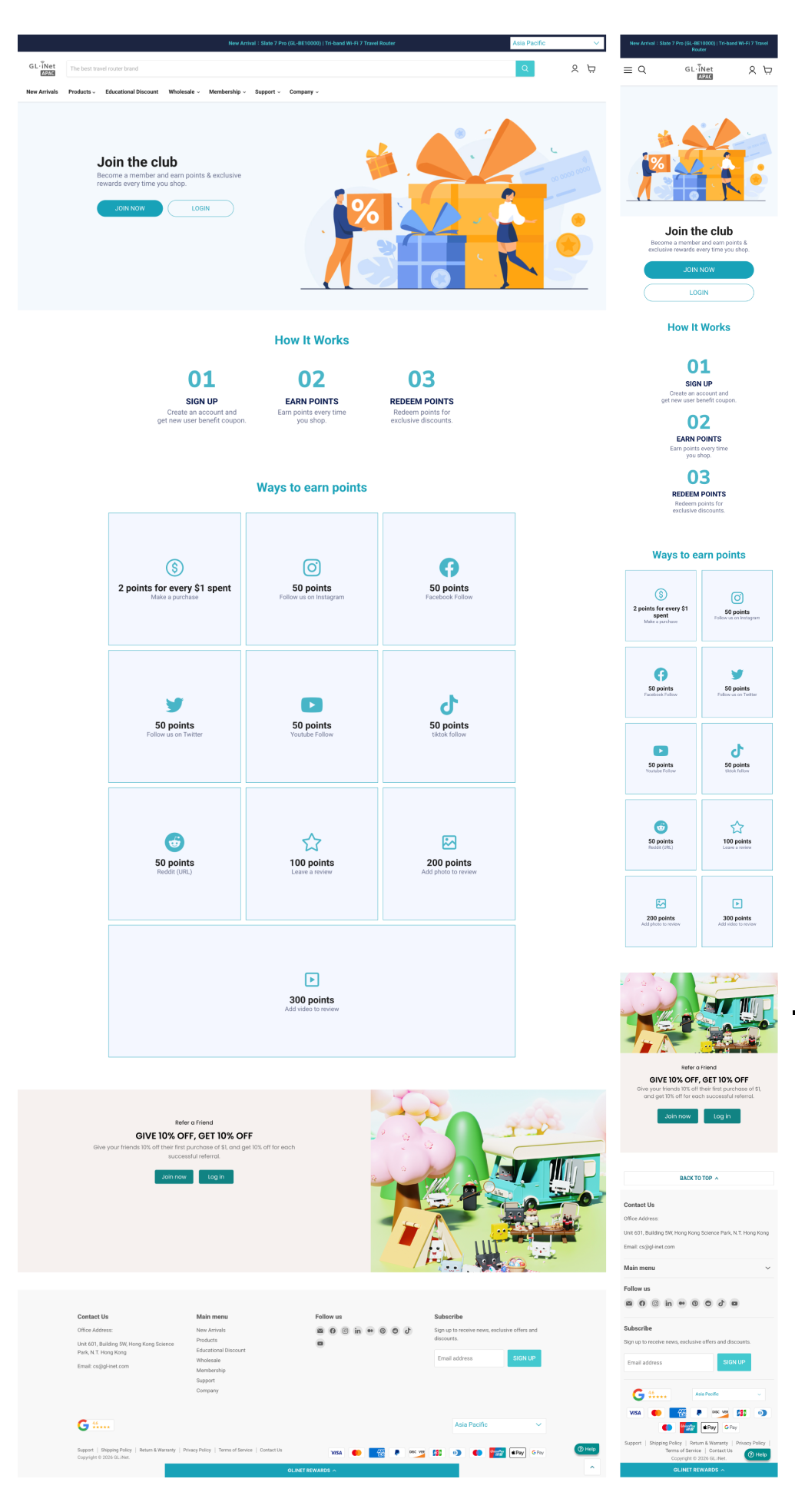
AFTER
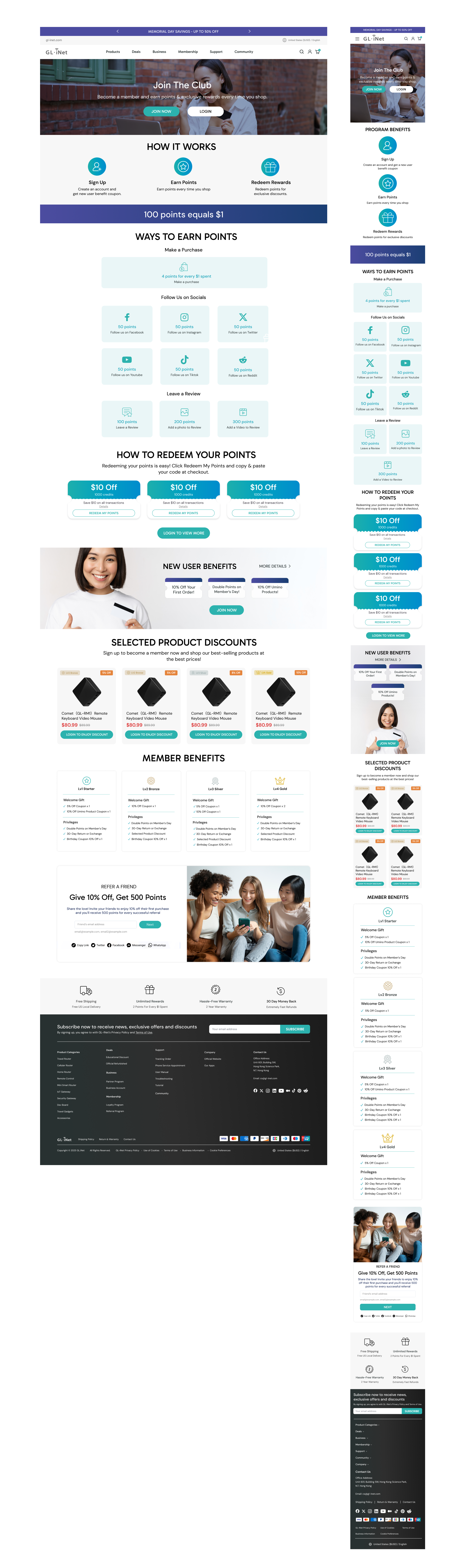
New Design
1. Expanded Content to Increase Perceived Value
I strategically expanded the content to address different user motivations and answer the question "What's in it for me?" at every stage. New user benefits provide first-time sign-up incentives (e.g., welcome points, first-purchase discounts), selected product discounts show members exclusive deals on specific products and member benefits overview give a clear summary of all perks (points per purchase, early access, special offers). This matters because users need to see the tangible value of signing up. A simple list of points does not create emotional urgency. Showing specific benefits (e.g., "Save 15% on your first purchase") makes the decision to join feel immediate and rewarding.
2. Visual Refresh Within Yotpo Constraints
The loyalty program is powered by the Yotpo app, which sets certain structural and functional parameters. Rather than fighting these constraints, I worked within them to maintain functional consistency while elevating the visual experience.
What I Kept:
Core Yotpo components (points balance, rewards catalog, redemption flow)
Functional layout for consistency with user expectations
What I Updated:
Color palette to align with GL-iNet's brand identity (teal/indigo accents, neutral greys)
Typography to match the site's global style guide (Gabarito headlines + DM Sans body)
Visual hierarchy to make key information (points earned, rewards available) more prominent
Spacing and padding to improve scannability
The Result: Users familiar with Yotpo-powered programs still recognize the functionality, but the page now feels distinctly like GL-iNet—not a generic third-party widget.
A loyalty program is only effective if users understand its value and are motivated to join. The original page communicated the mechanics of points without selling the benefits. By expanding the content (new user benefits, selected discounts, member perks) and refreshing the visual presentation within the Yotpo framework, I transformed the loyalty page from a functional requirement into a conversion tool—one that feels like a natural part of the GL-iNet brand experience.