
Algordanza Order Form




Project Type: UI/UX
Timeline: Nov 2024 - March 2025
Role: Lead Designer
Algordanza is a Swiss-based global leader in producing memorial diamonds—transforming cremation ashes into certified diamonds. Our agency had previously worked with the Hong Kong branch to build their website using HubSpot, which served as a central hub for their customer information, order data, and marketing needs.
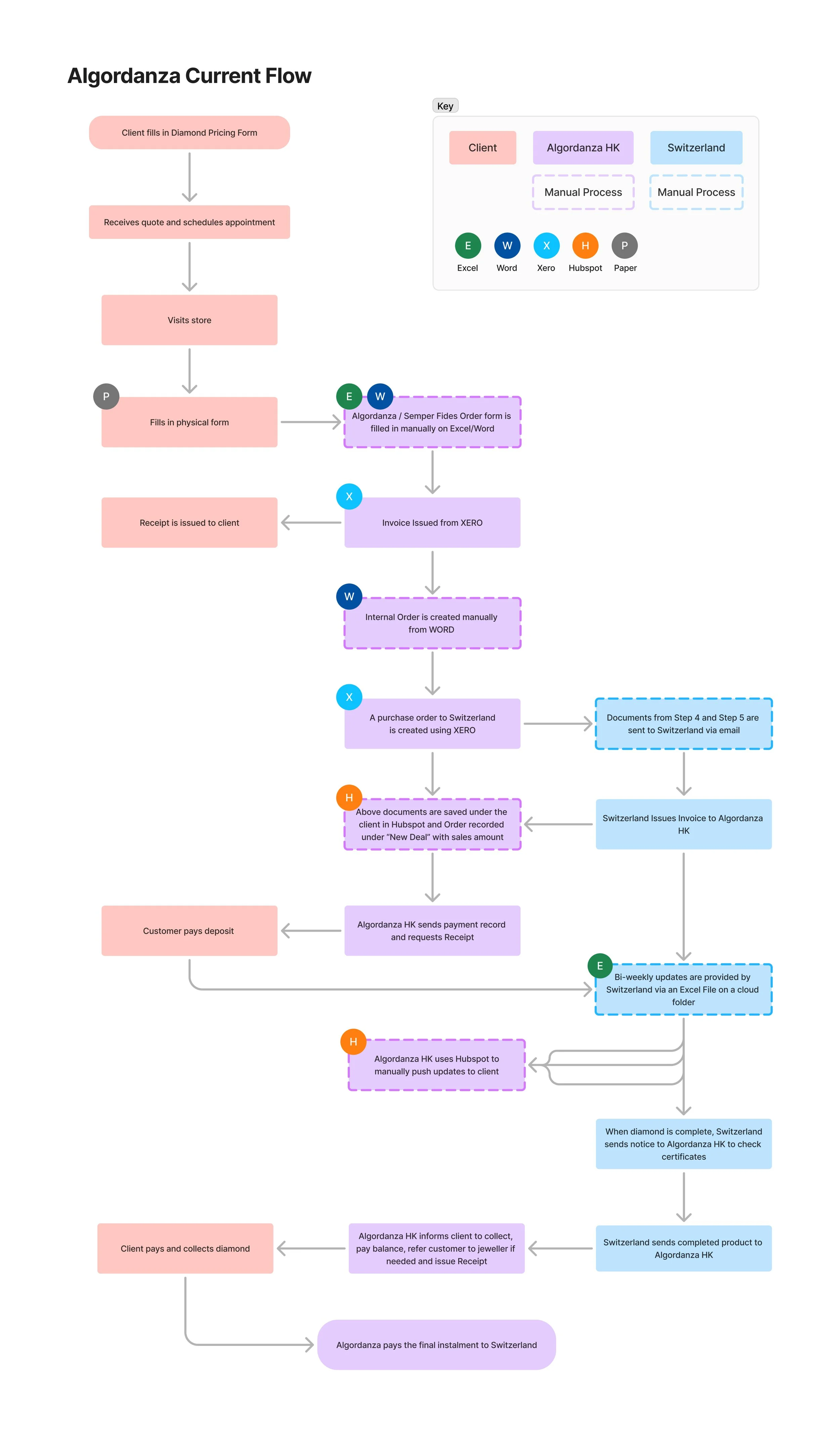
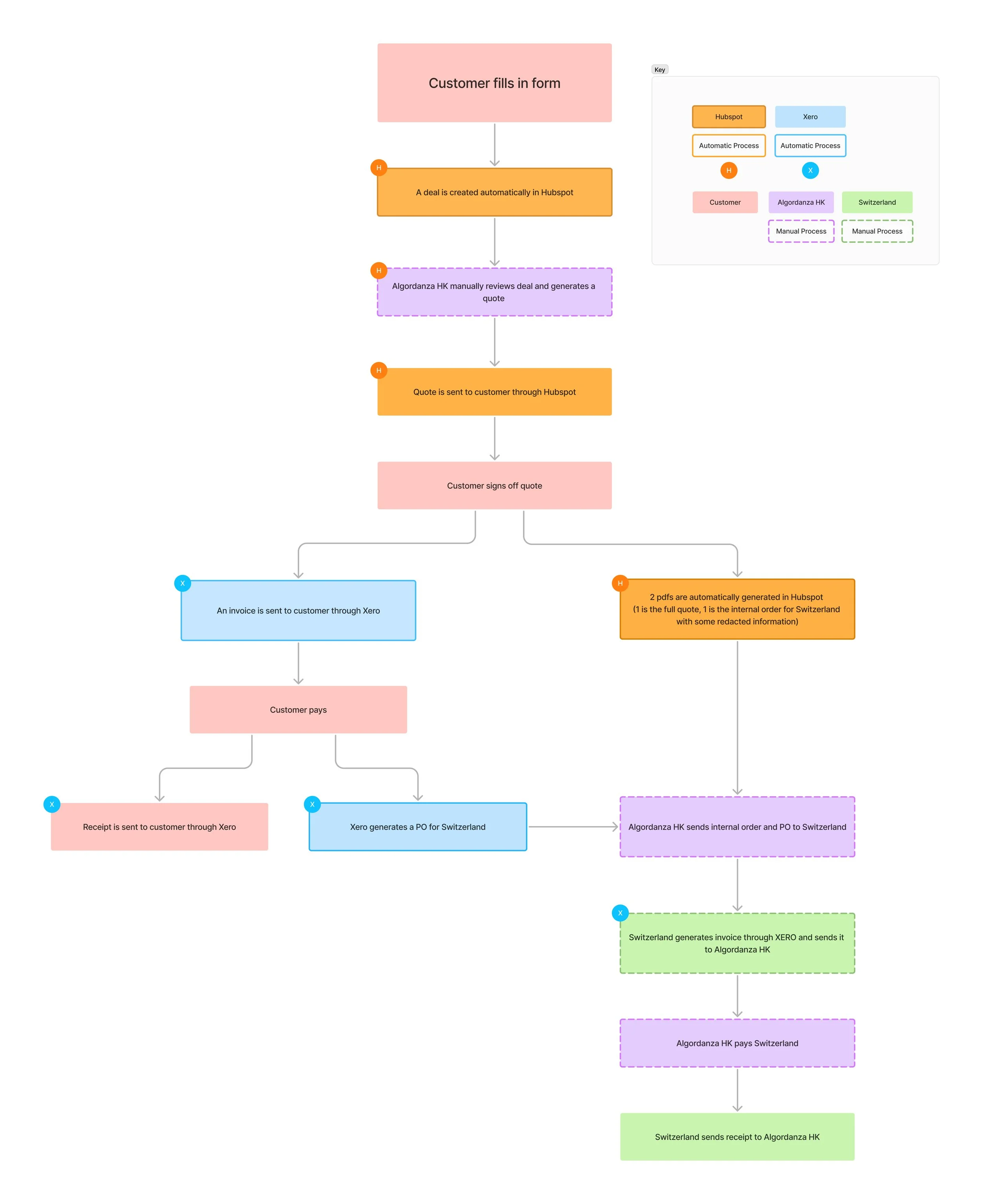
Despite this foundation, Algordanza Hong Kong's ordering process remained largely manual and paper-based. Staff spent significant time on repetitive data entry and manually updating order progress. Additionally, numerous steps were required to liaise with different parties to complete each order. Hence, the goal of this project was to design a digital form solution that would simplify and automate the order flow, from integrating with Xero for payment processing to leveraging HubSpot CMS for automated lead scoring and pipeline tracking.
The Problem/Opportunity
The problem we identified was that many small businesses within the food industry lack an effective online presence. The lack of user-friendly options make it difficult for difficult for customers to order items even if they want to, so businesses will take a huge hit during pandemic and lockdown times when customers aren’t allowed in stores or there are capacity restrictions, as there is a lack of foot traffic and delivery options. In fact, owners of food services and drinking places were much more likely to report lower revenue in 2020 than businesses overall (86.5% versus 60.5%). Many restaurants have adapted to the pandemic by shifting to contactless delivery and take-out service, with almost one-fifth (19.4%) making 30% or more of their sales online in 2020, more than double the rate in 2019 (9.1%). Also more and more customers want to have the option to order online even in the future and half (50.7%) of these businesses said that they were likely or very likely to permanently adopt contactless delivery or pickup options going forward. The digital customer experience will be critical to retaining current customers and capturing new ones, hence digitization is something that will become even more important to the food industry moving forward.
User Research
The target users for this problem would include both customers and businesses. On the customer side, our target user belongs to the 18-34 demographic, as they are the largest demographic who uses services such as Yelp and Skip the Dishes. For example, a mid-20’s foodie who enjoys finding new places to try, but has trouble doing so, especially when they’re in unfamiliar neighborhoods. Looking at online reviews and the restaurants digital presence can help, however it’s very inconsistent, as not all restaurants have enough reviews or a good digital presence. The less information there is, the less likely they would buy from the restaurant. I interviewed a few people within the target demographic and discovered that they are frustrated at the difficulty of finding information about certain smaller restaurants (i.e. they only have an instagram presence or a badly designed website) and discovering new restaurants themselves, especially concerning the lack of menus. They found delivery and takeaway options to be quite varying as well, especially for places like dessert shops, bakeries and cafes and did not like having to call the restaurant to ask questions. They also want to be able to have the option to reserve tables as well to join a remote queue, for convenience and liked the idea of having discounts and coupons. Another suggestion was being able to bookmark restaurants and create collections for future reference, as well as filter restaurants for dietary needs.
On the business side, our target user would be small restaurants within Toronto, for example a bakery that my teammate interviewed as part of our business challenge. Bakeries and other places such as dessert shops in general have a more volatile menu that is subject to change and they also tend to take on customized or more in the future orders, so being able to digitize and present that as an option to customers who can’t or don’t want to make orders in person would be very valuable. Other pain points would include making sure customers are always interested, being able to keep return customers, the difficulty of marketing on Instagram and competing with other restaurants. Gaining more exposure in general was also quite challenge. They found that having Uber promos and having more good reviews was useful in keeping customers engaged. All in all, there is a lot they need to change to make sure that they maintain a customer base, especially because they were closed for so long due to the pandemic.

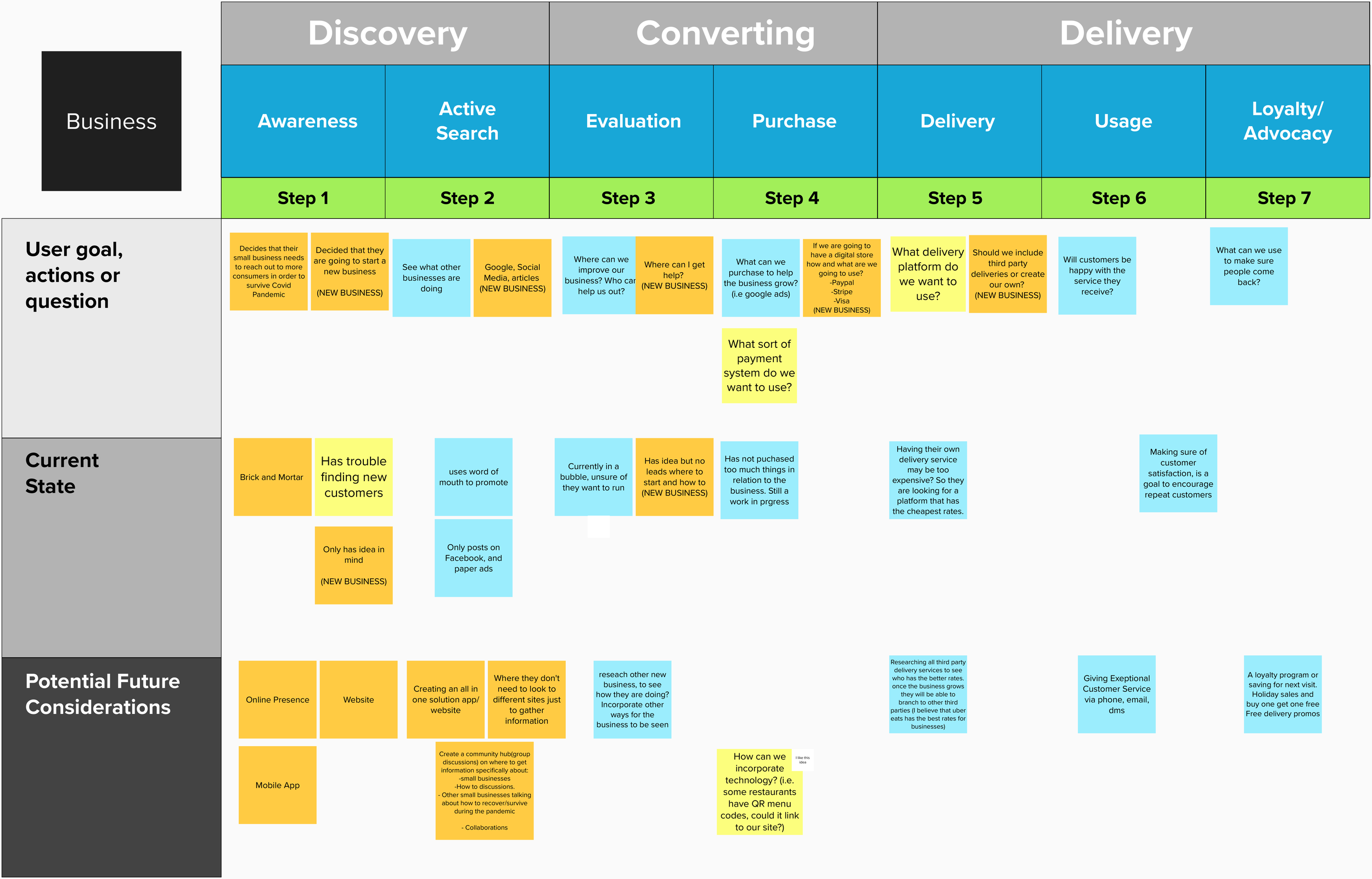
Customer Journey Mapping
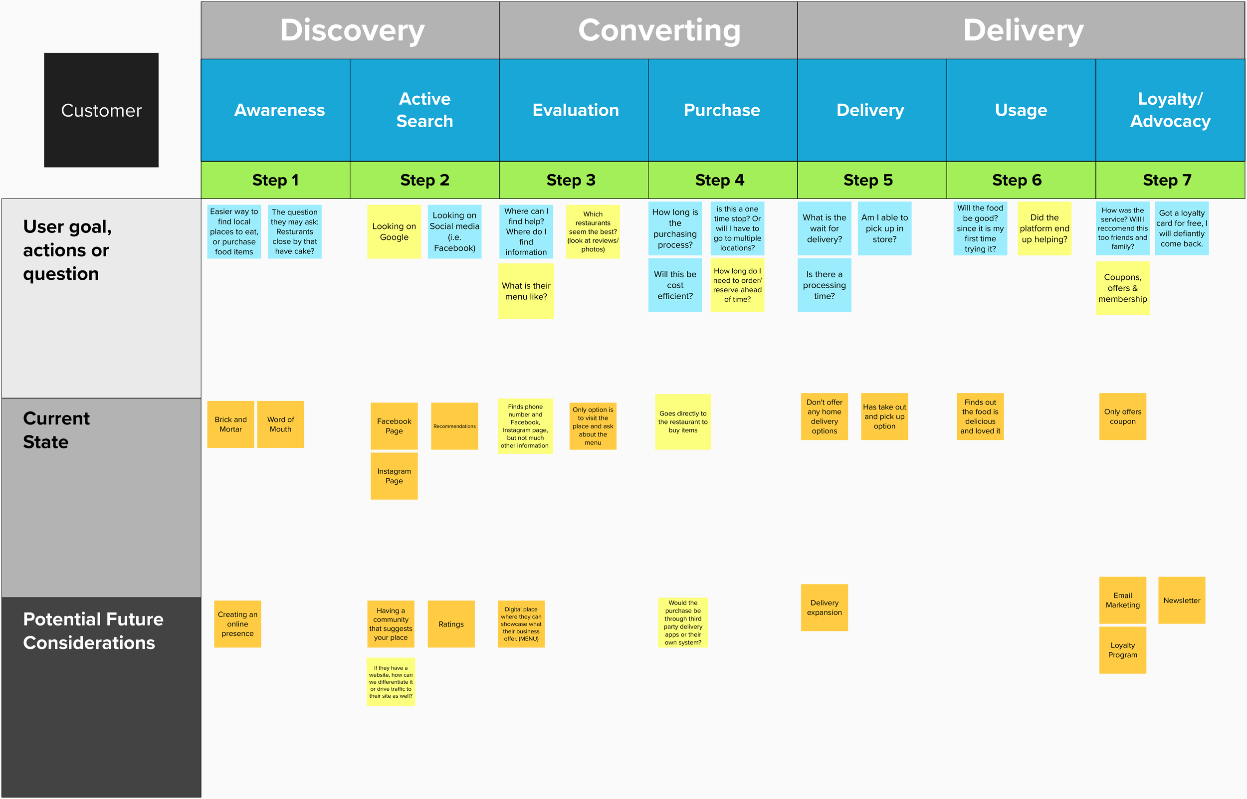
Needs & Pain Points
Based on a few interviews we conducted with our target users, we identified their most important needs and pain points.
Consumers:
Standardize content and provide consistent information across all restaurants, so we can bridge the gap between the variability of menus between different restaurants and provide the information customers need to be able to make easier decisions
Improve on filtering options in search functions
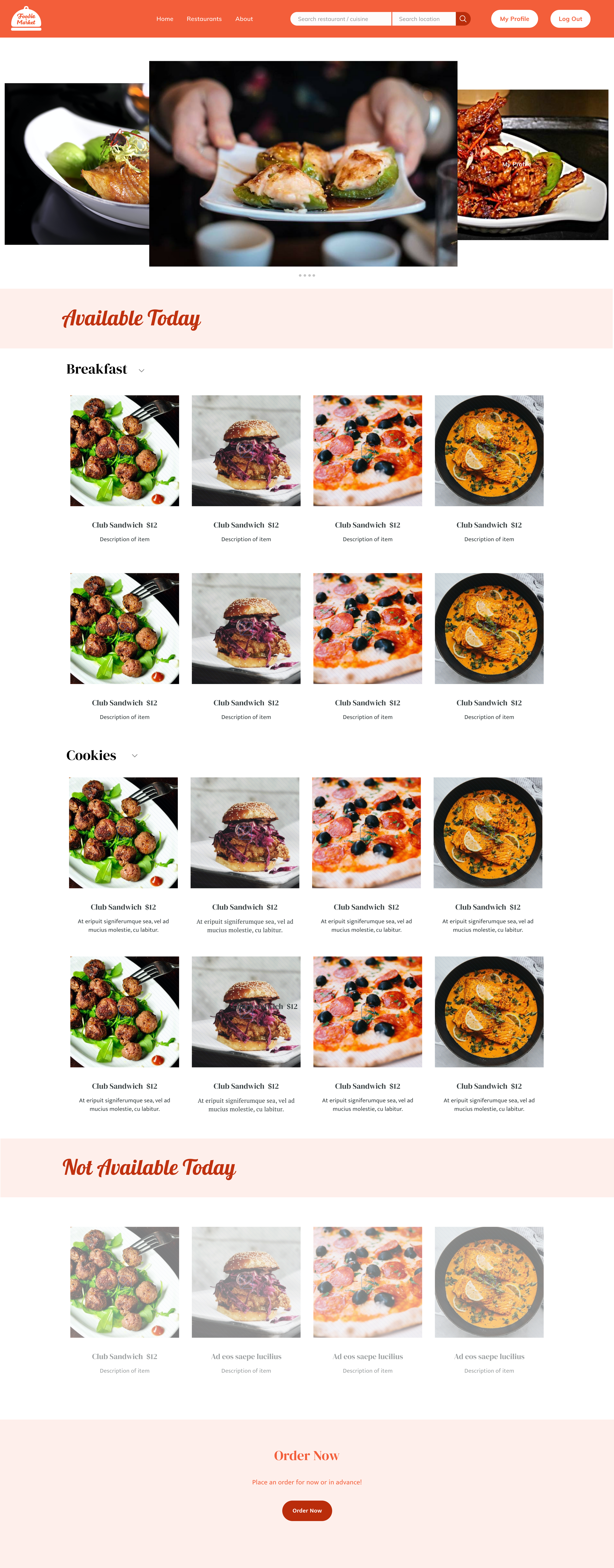
A clear menu for all restaurants
Have the option to reserve tables and join a remote queue to cut down wait time
Have the ability to bookmark restaurants and create collections
Being able to filter restaurants for dietary needs
Better delivery and takeout options if it’s lacking
Discounts and coupons provide more incentive
Businesses:
Want to gain more exposure
Trouble marketing and digitizing
Keeping customers interested
Attracting new customers
Being able to change items on menus
Product Overview
Digital Presence & Use of Technology
2. Delivery Expansion
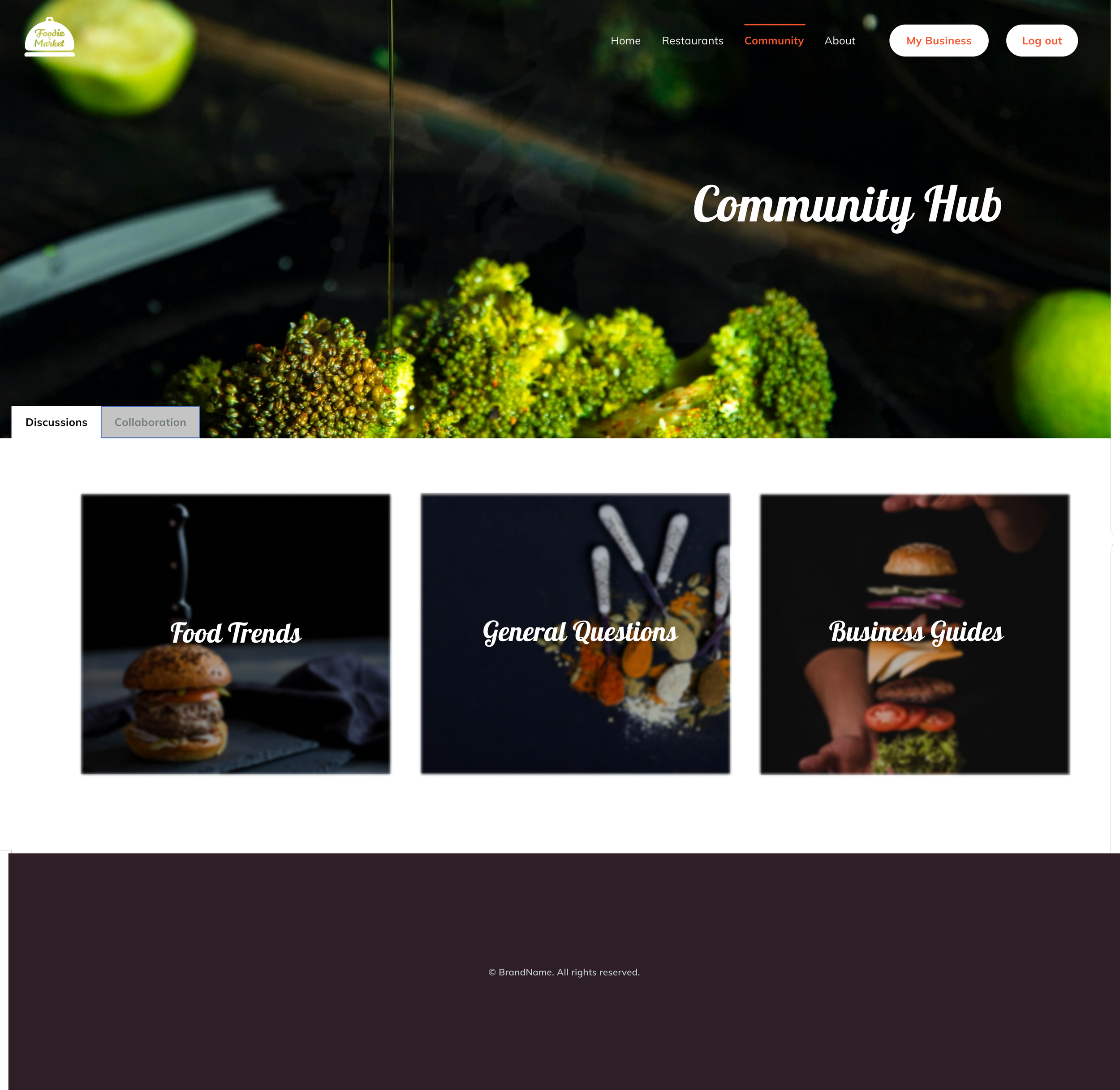
3. Community Outreach
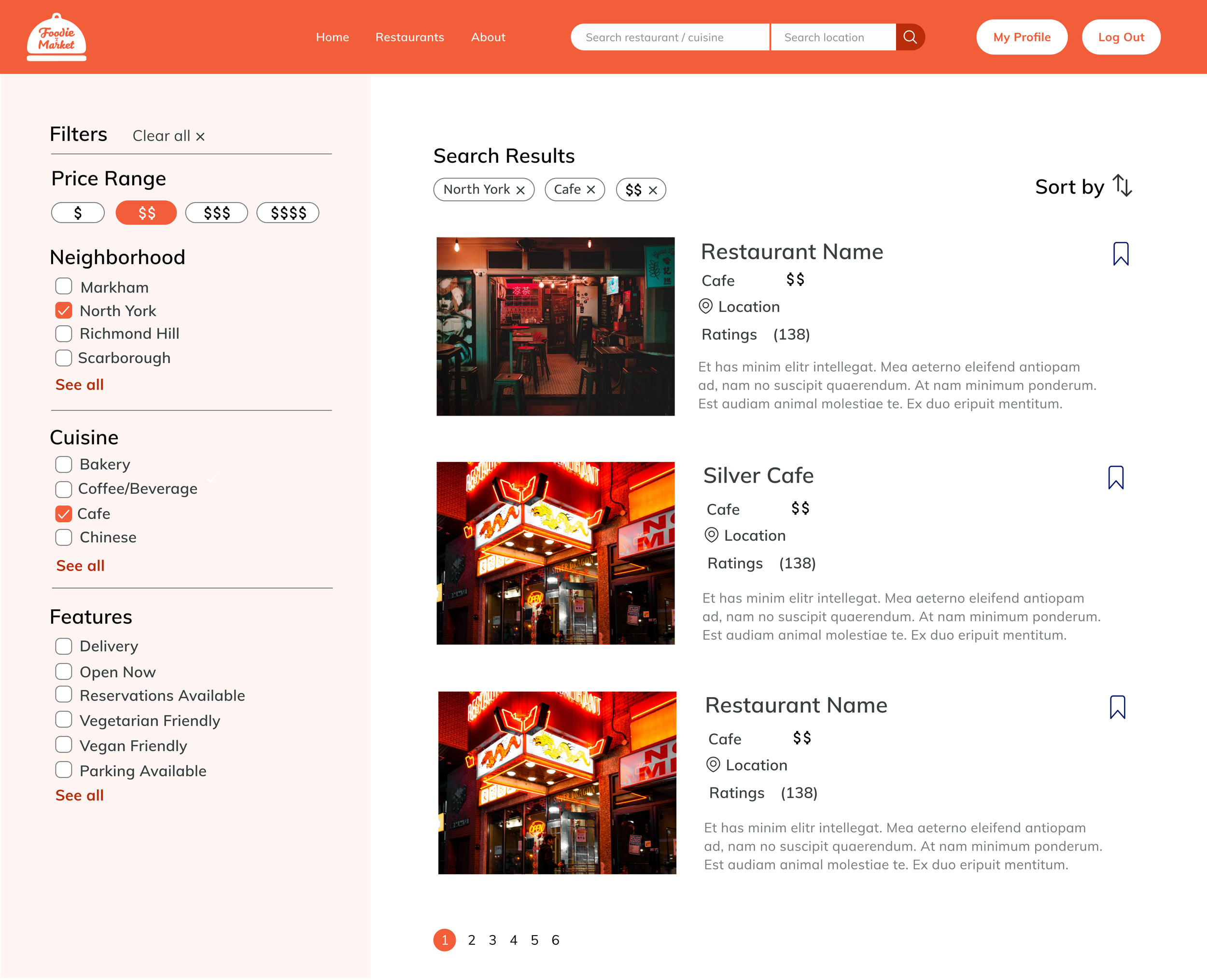
The key benefits of our solution include networking/outreach functions for businesses, more delivery and curbside pickup options and our technology can help them with digitization, in regards to the ordering system, digital menu and table reservations. Our site will also allow them to promote their business more effectively and make it easier for customers to discover them. On the customer side, the key benefits are convenient functionality. For example, they are able to see the full menu of restaurants/bakeries, reserve tables, get and use coupons, join a remote queue to prevent long waiting times, write reviews and see ratings and bookmark restaurants for future consideration all on one site. They can also discover more restaurants and see what they have to offer much more easily. We’re really looking to leveraging the use of technology to both help businesses grow and better the customer experience.
Sitemap

Wireframes & Designs




Brand Elements

Prototype
User Testing
We interviewed a few users from the target demographics on both the customer and business side and explained the site, showed them different versions and walked them through the IA and user-flow before showing them the screens we had created.
Customer Insights:
They really liked the design and idea of the site and thought it would be really convenient and useful in finding out more information about small restaurants.
However, they found the homepage to be a little confusing and redundant, with the Featured Restaurant, What’s Hot and Weekly Chart.
Business Insights:
They loved the overall idea of the site, as “an online marketplace would be super useful to small businesses to help them get the customers they need to survive”
The layout is really pretty
Being able to have a singular site that would help me promote the business
Although it might be very competitive, not that it is not competitive on uber, skip or doordash.
Although these platforms have a way for small businesses to grow, by using discounts and promotions.
Being able to have a one stop shop is something that has not been seen before. you have promotions and discounts you also appear on the first page. However it does not help too much because it depends on people clicking in a way. It is not really a form of marketing or a place where we can explain our product. People usually already know us or have ordered from us before.
When watching users interact with the prototype it seemed very straight forward
It is very user friendly
They enjoyed the idea of the website it
The colours were very captivating
They would enjoy using this as a marketing tool
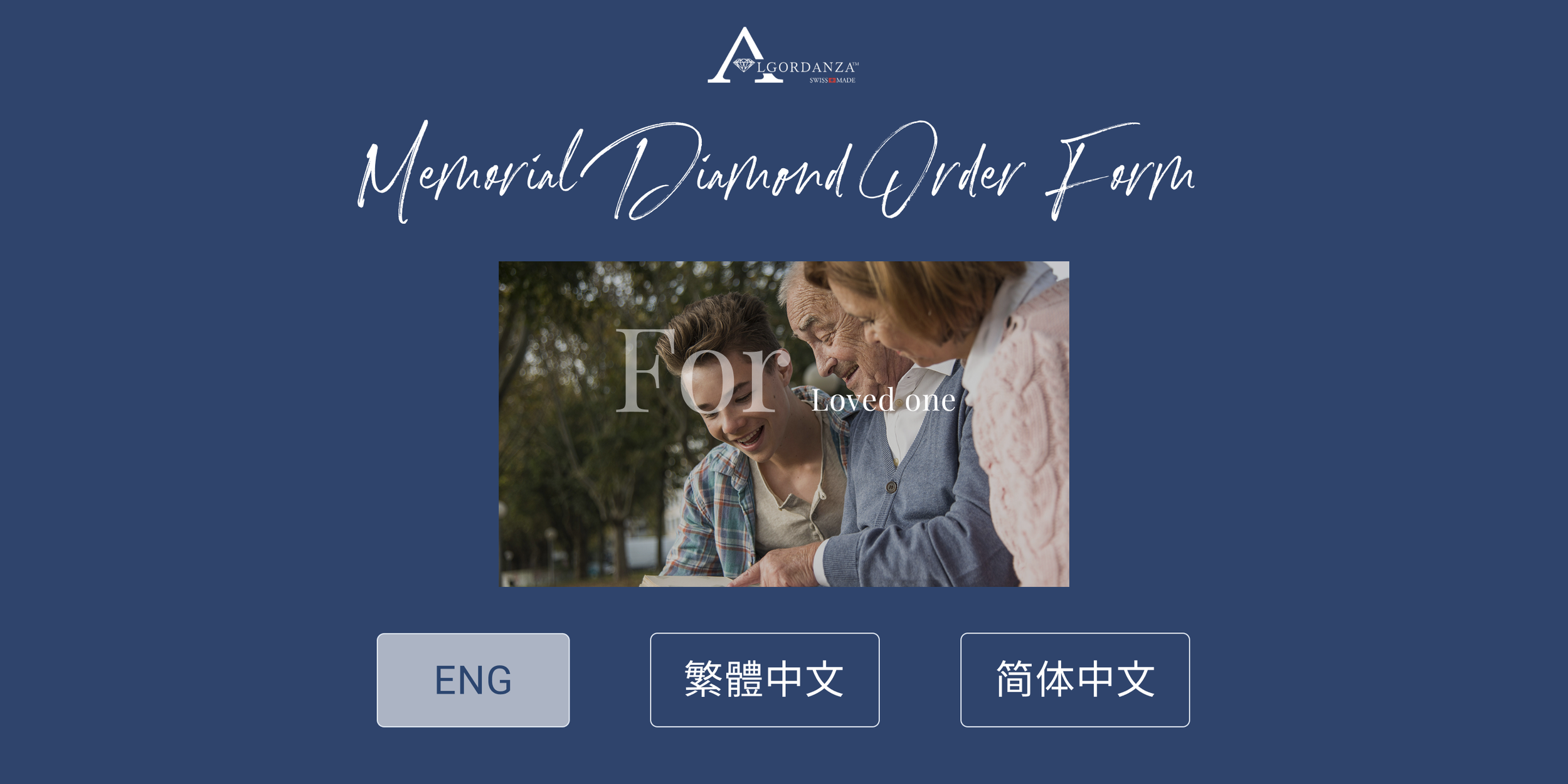
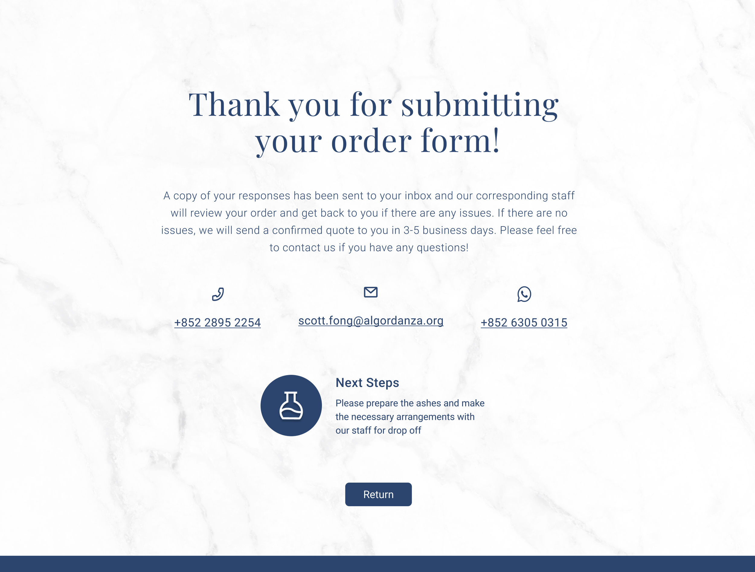
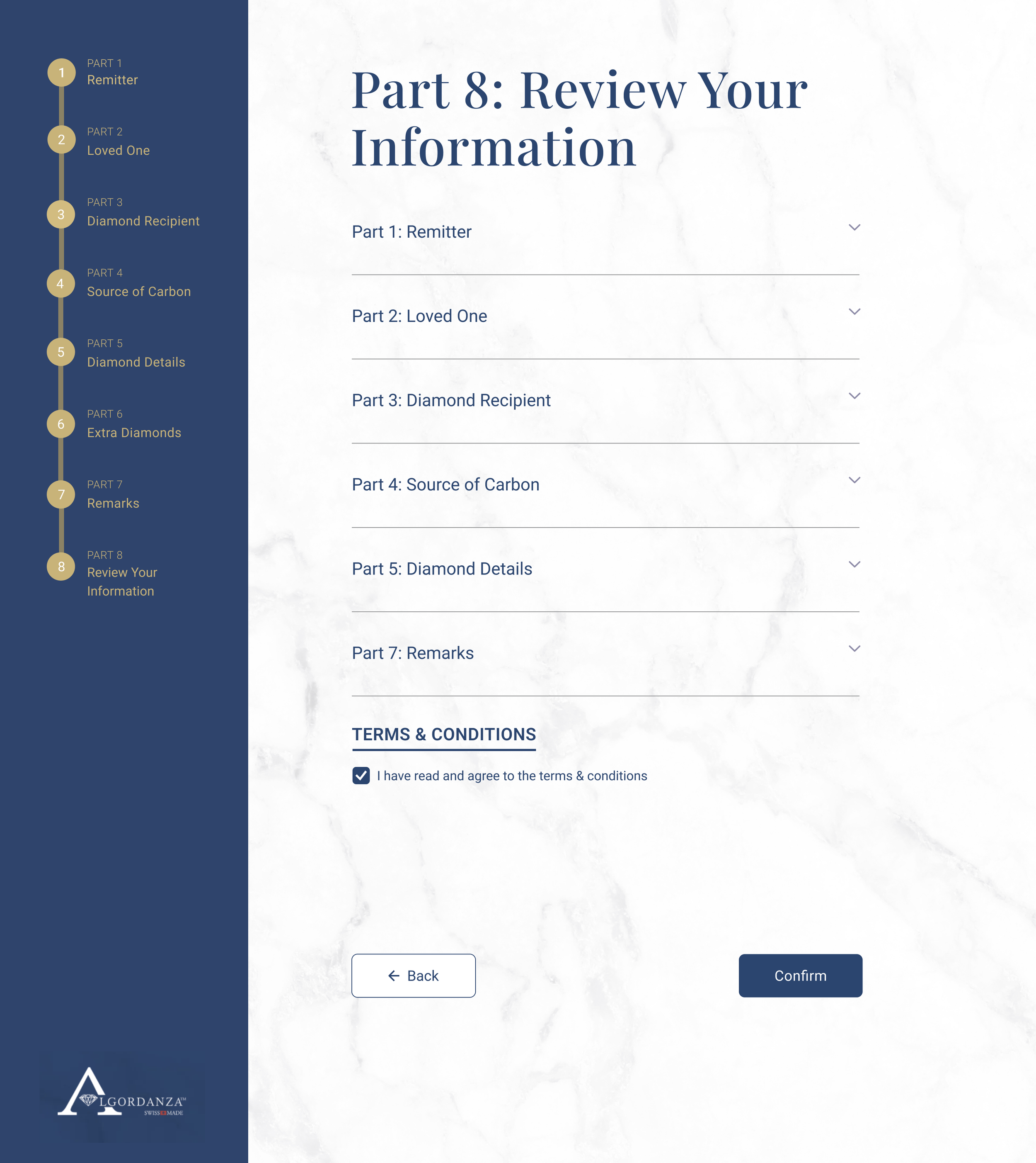
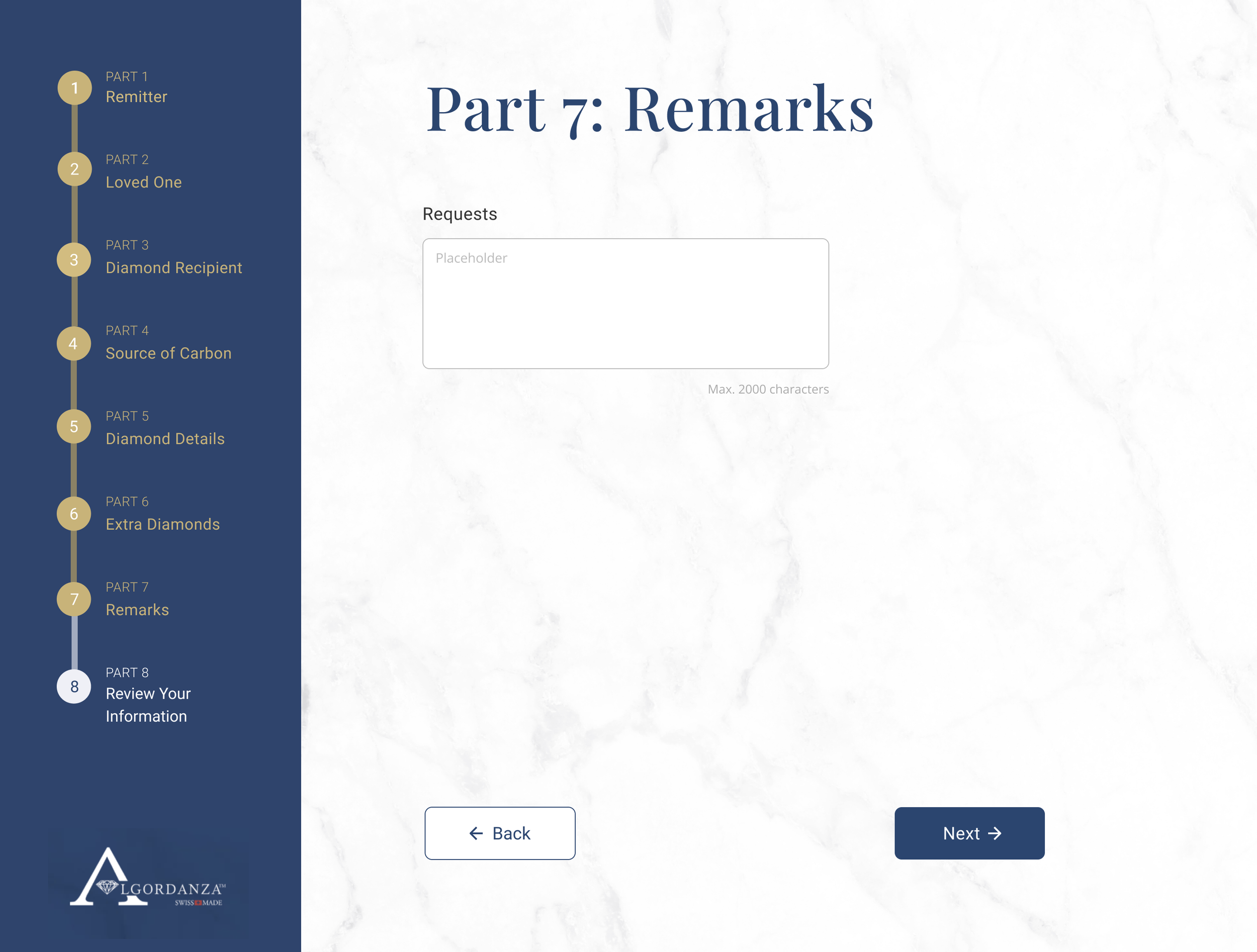
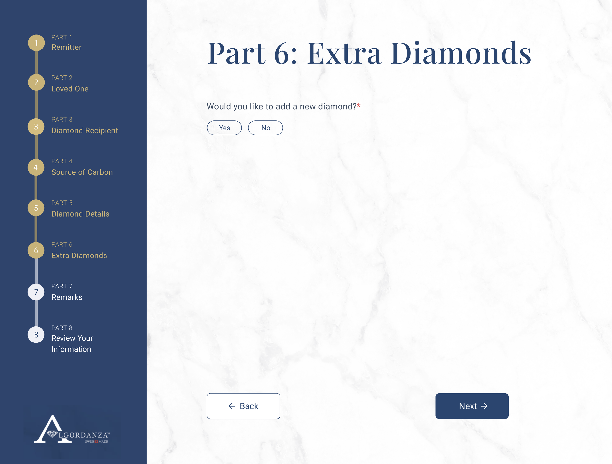
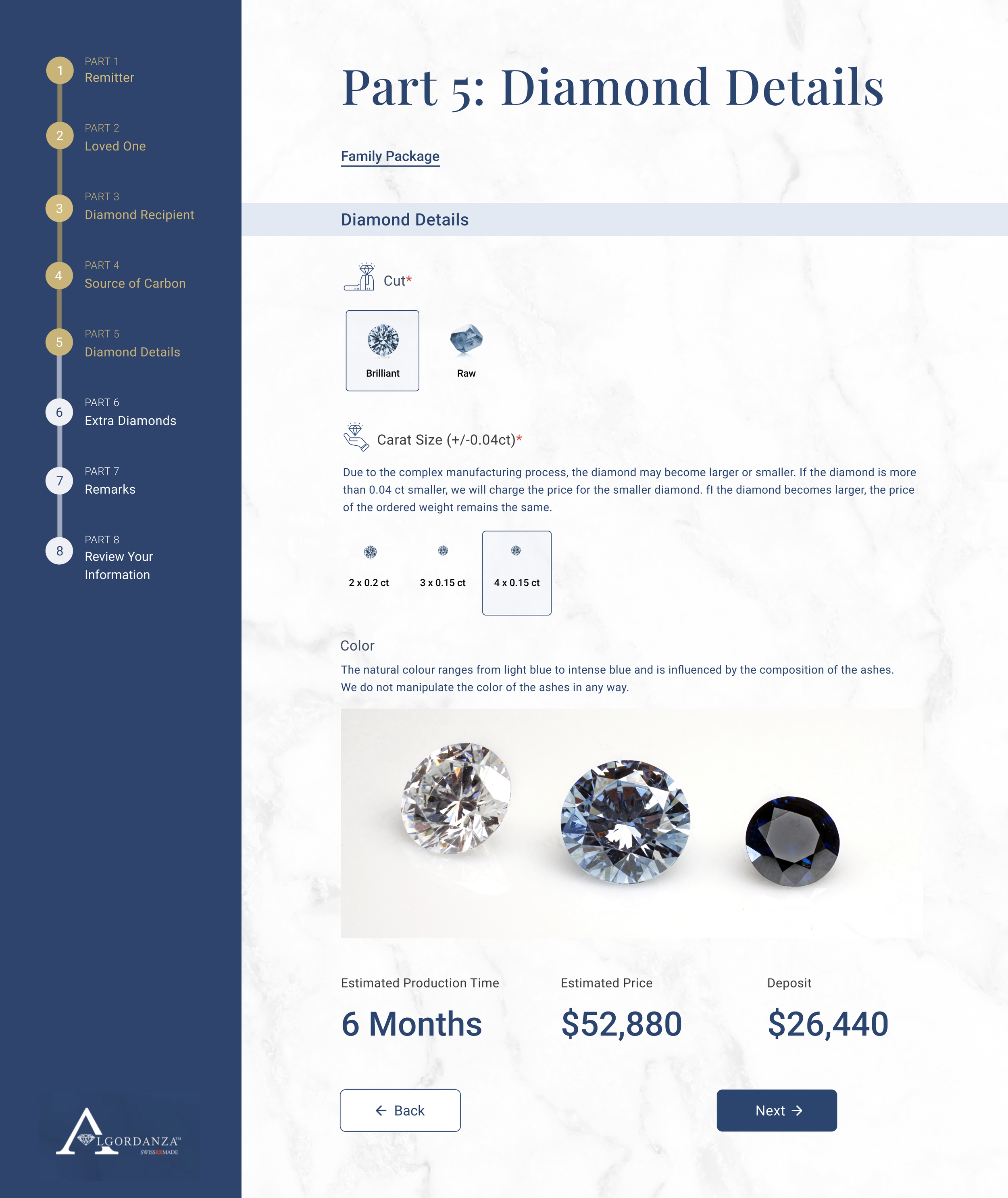
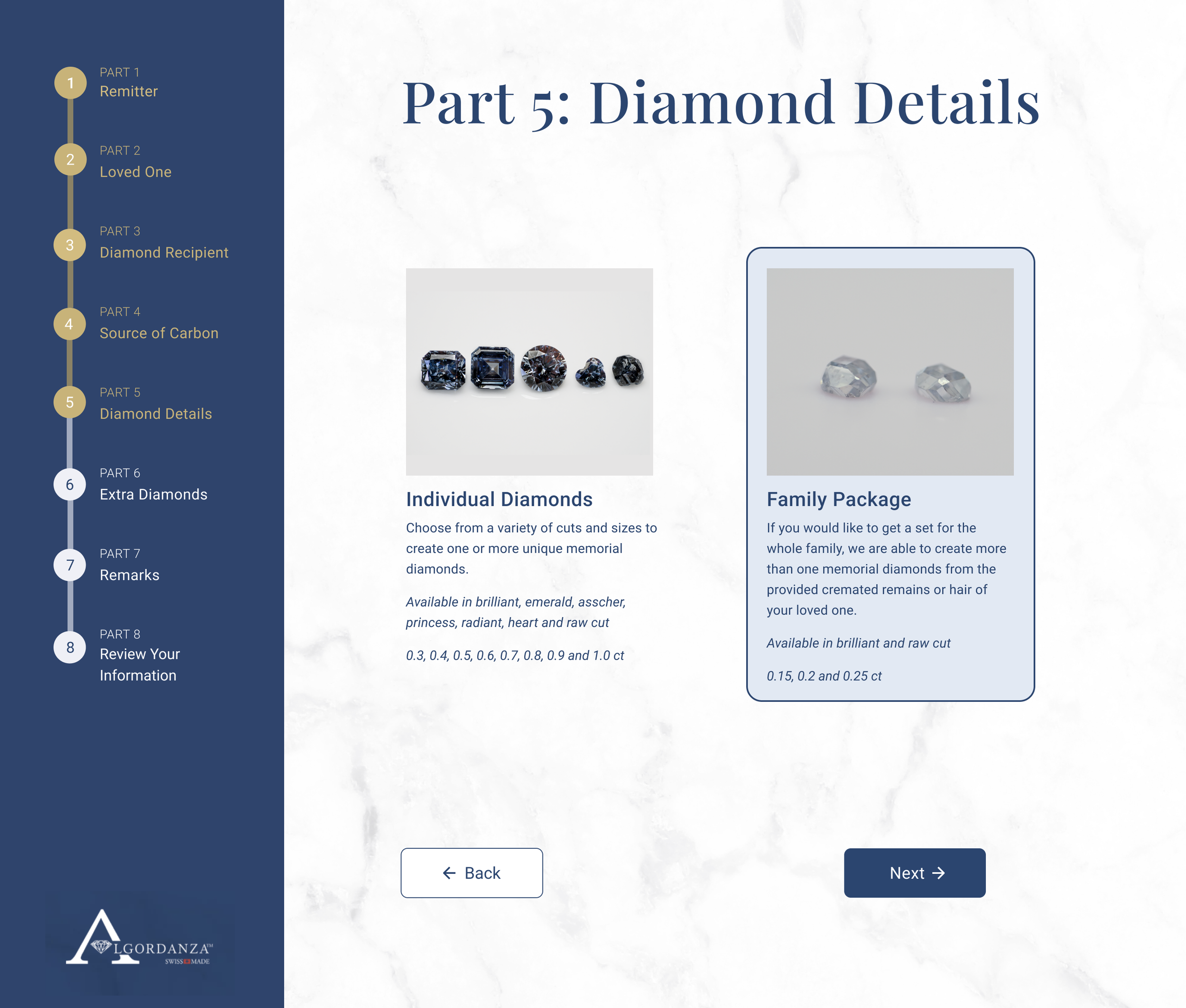
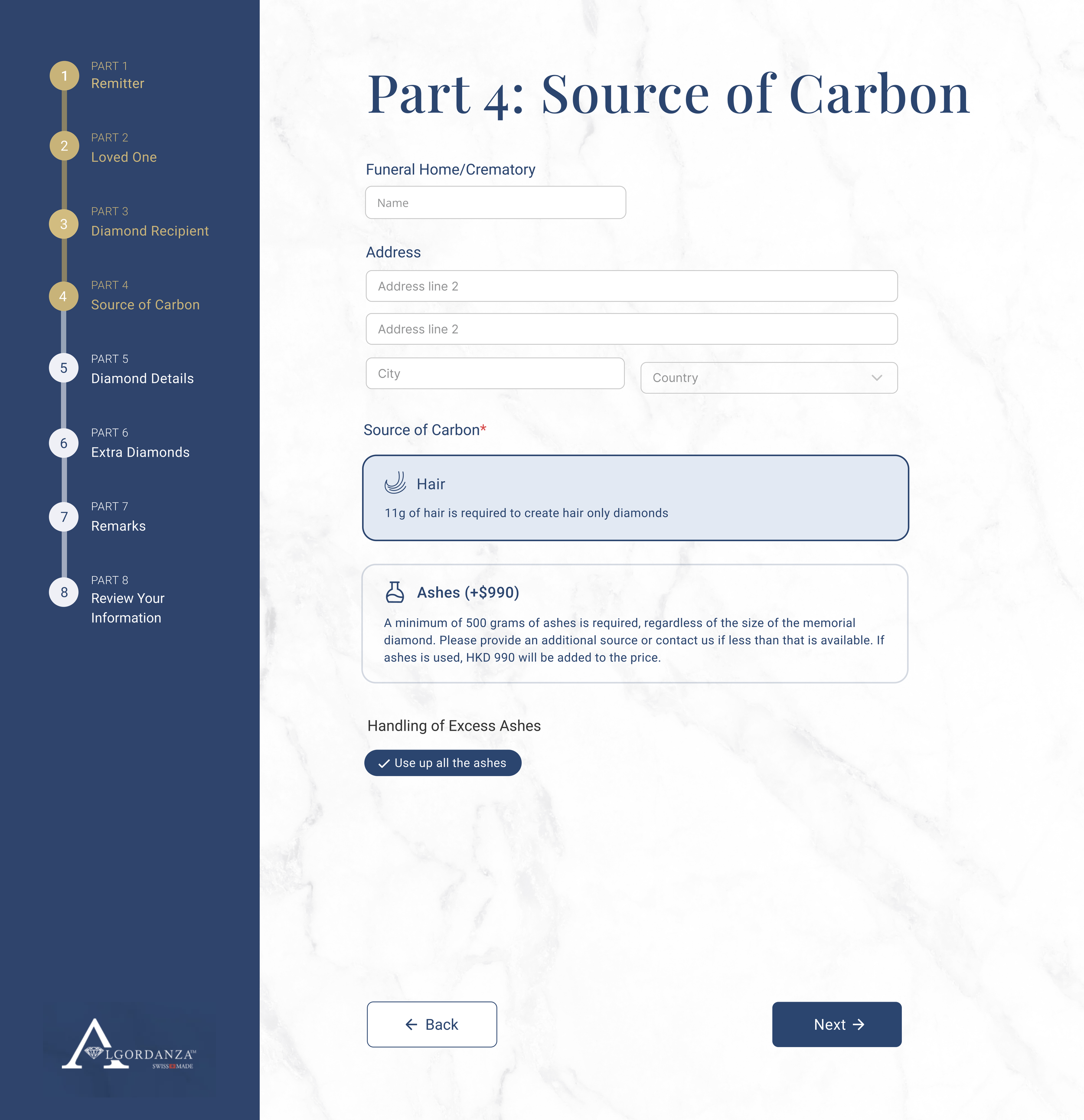
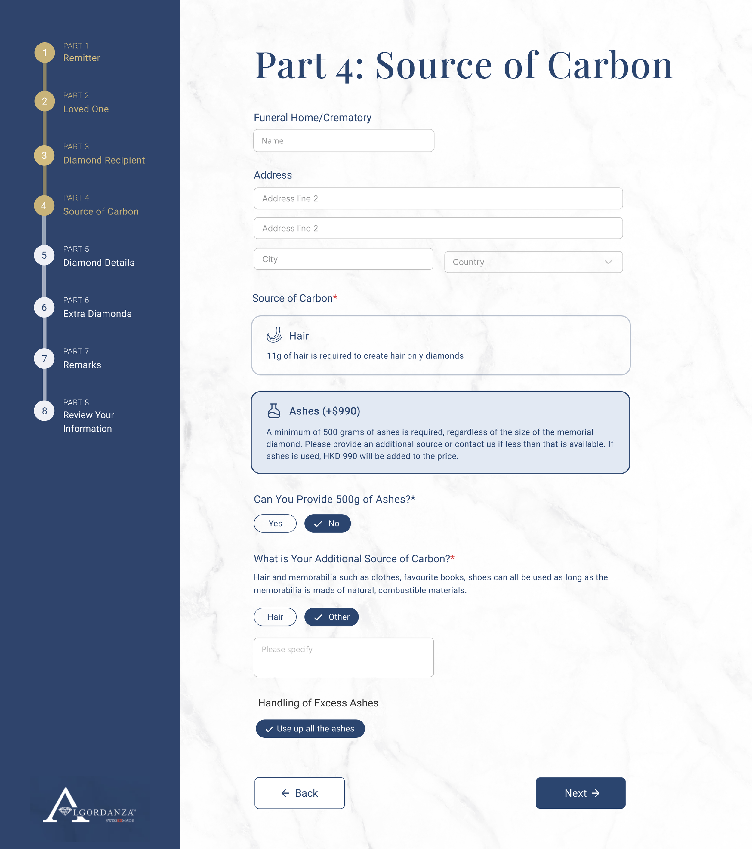

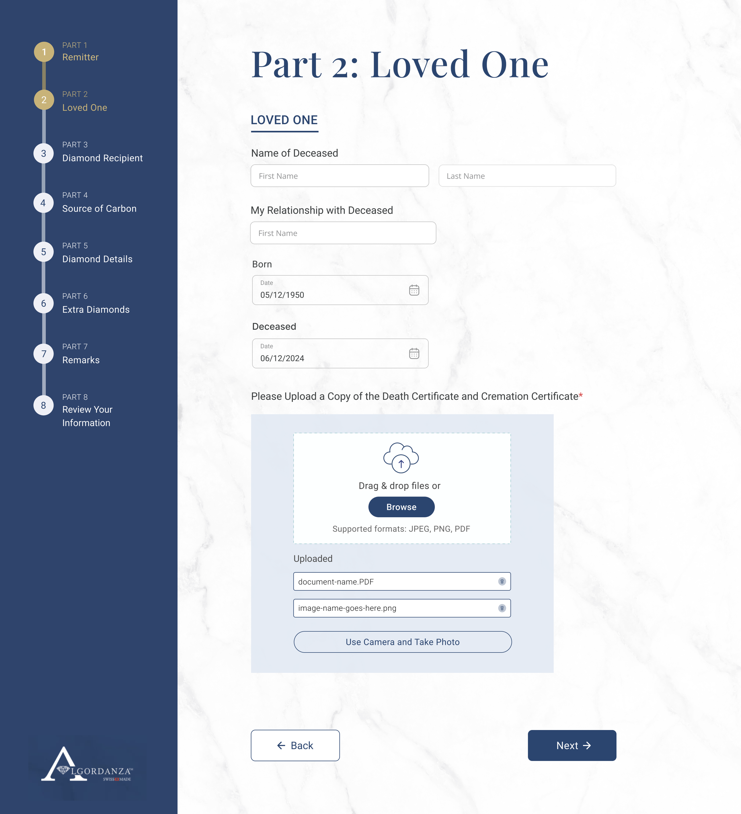
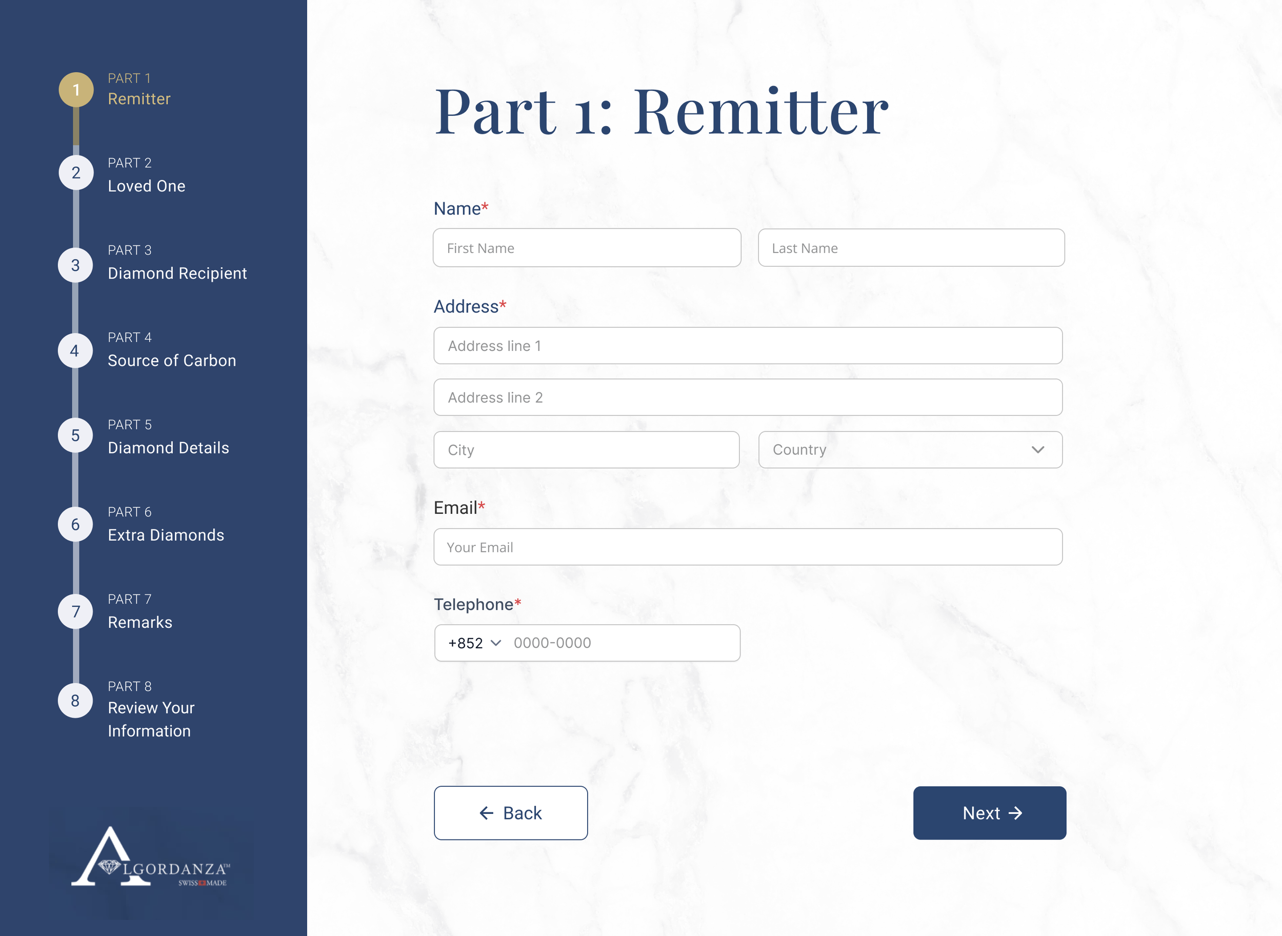
After refining the design with the client, I proceeded to develop high-fidelity prototypes in Figma, utilizing its capabilities to create clickable content and demonstrate conditional rules to make the logic understandable for both developers and the client.
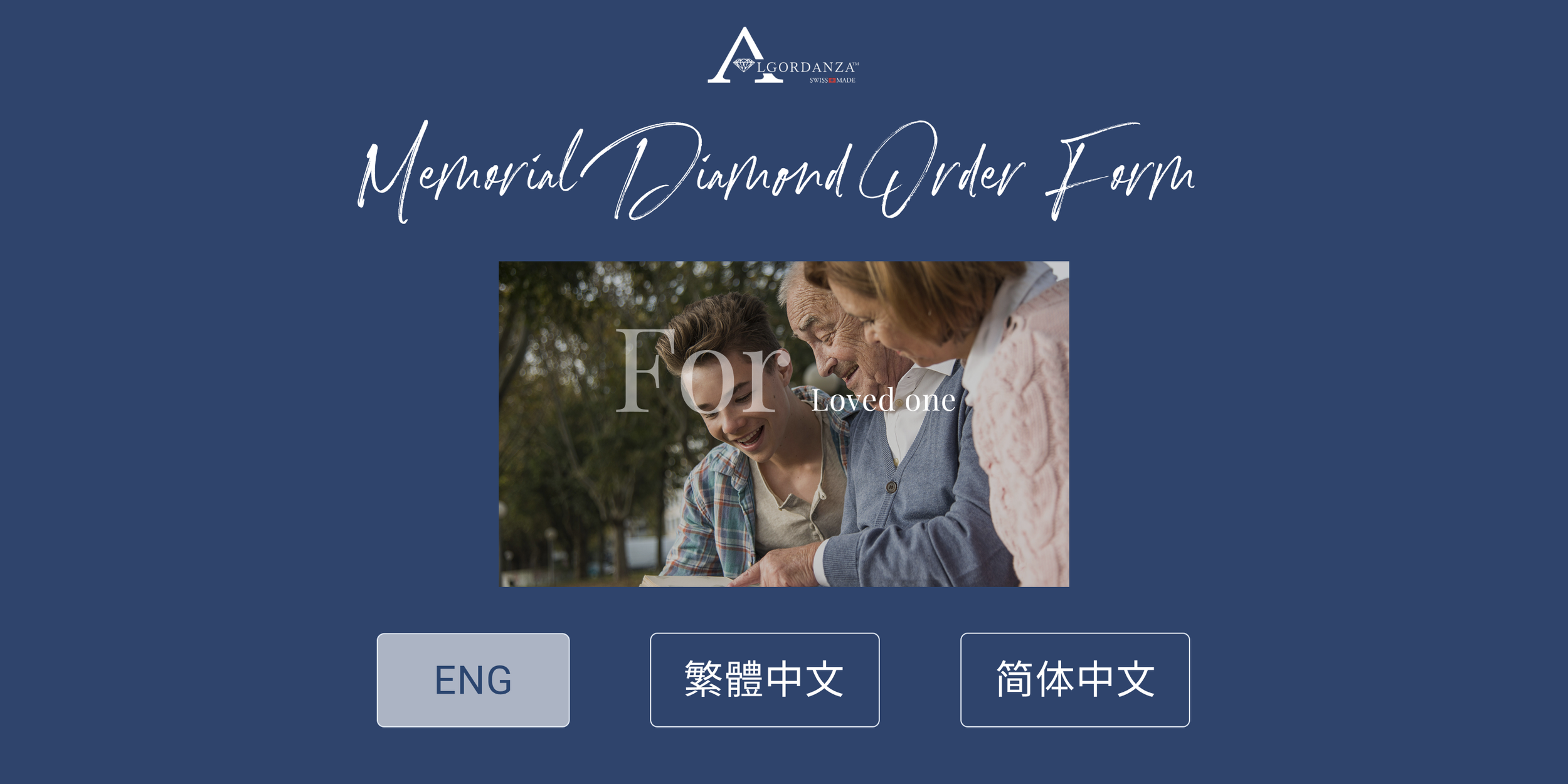
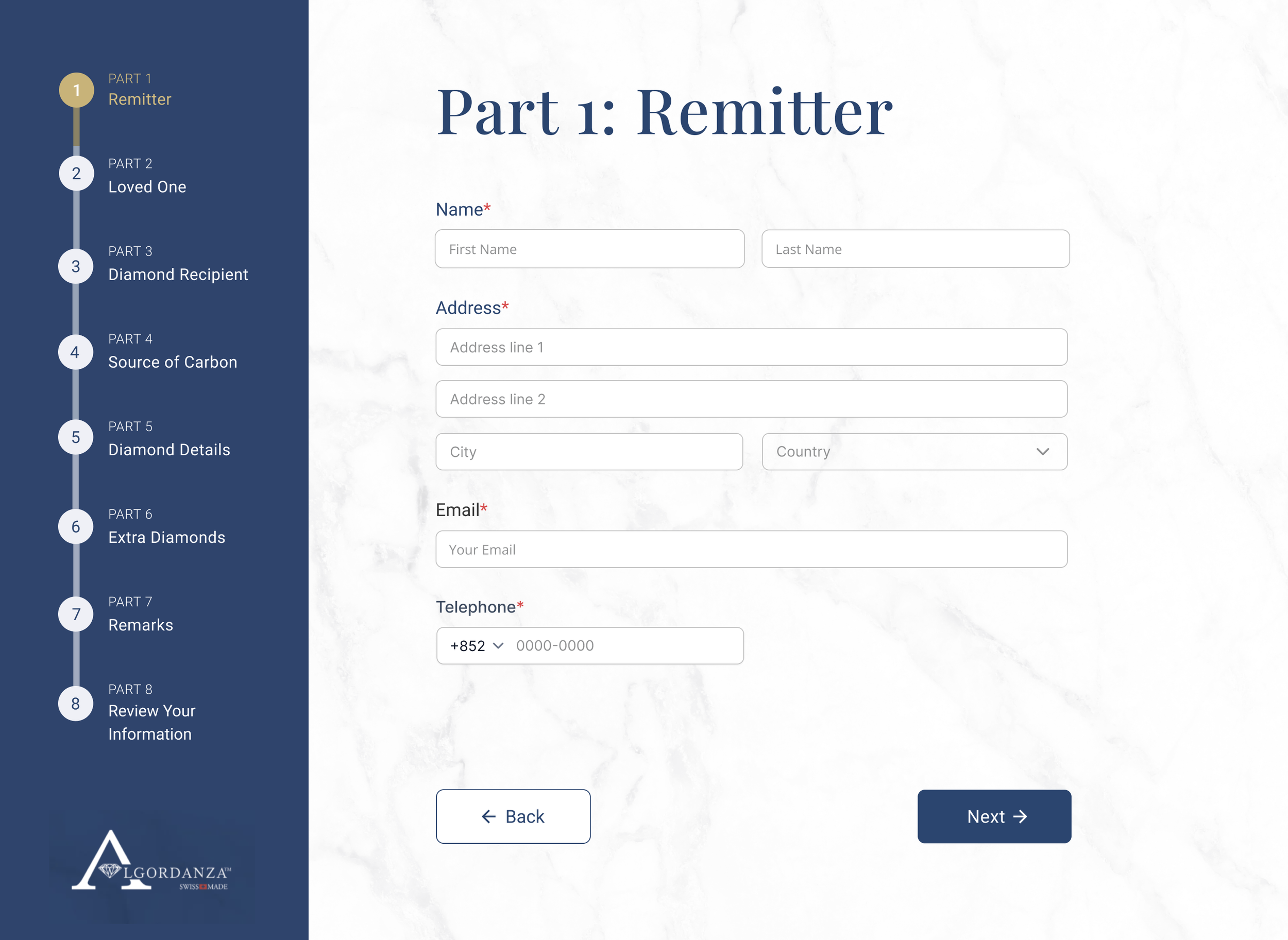
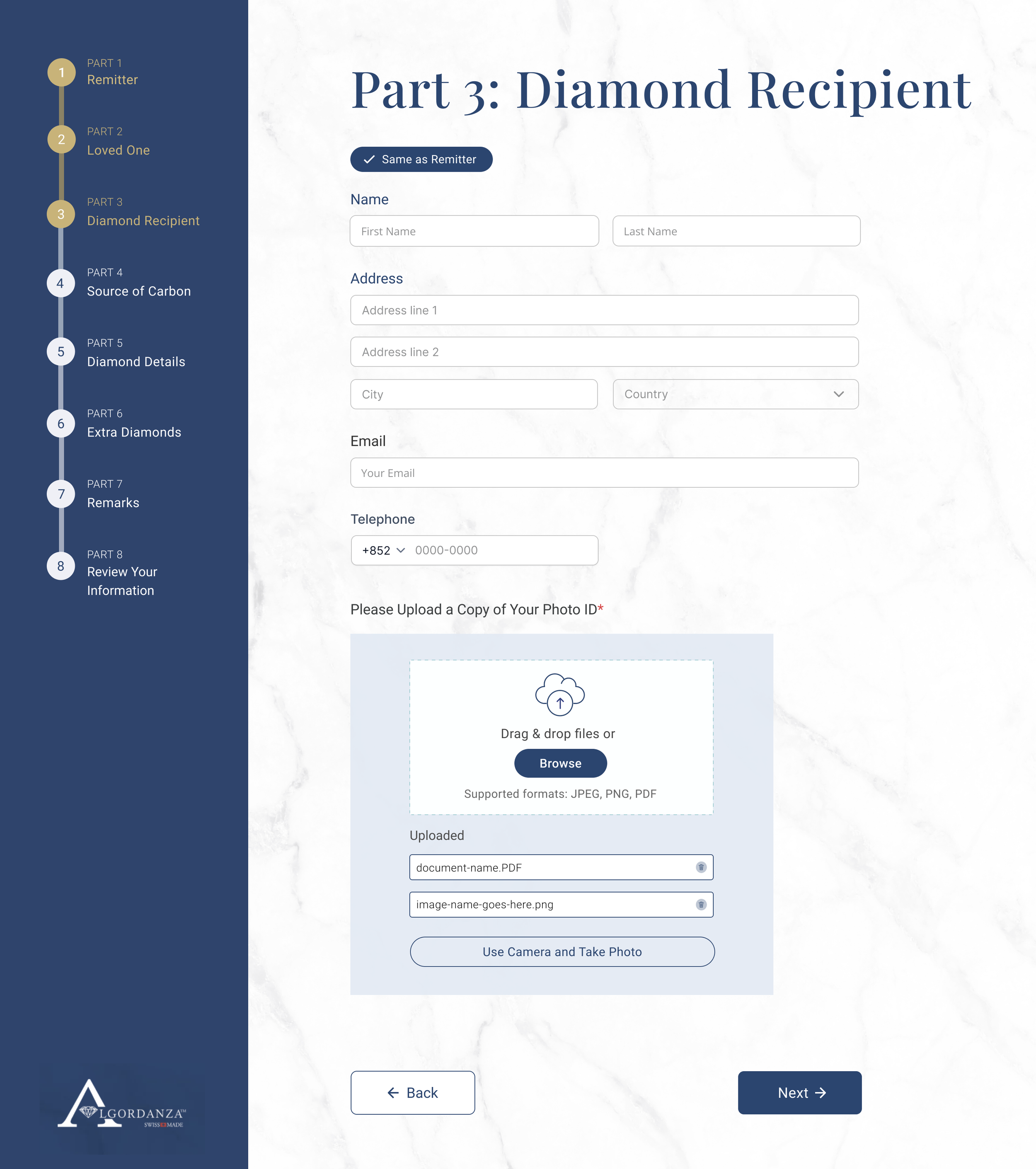
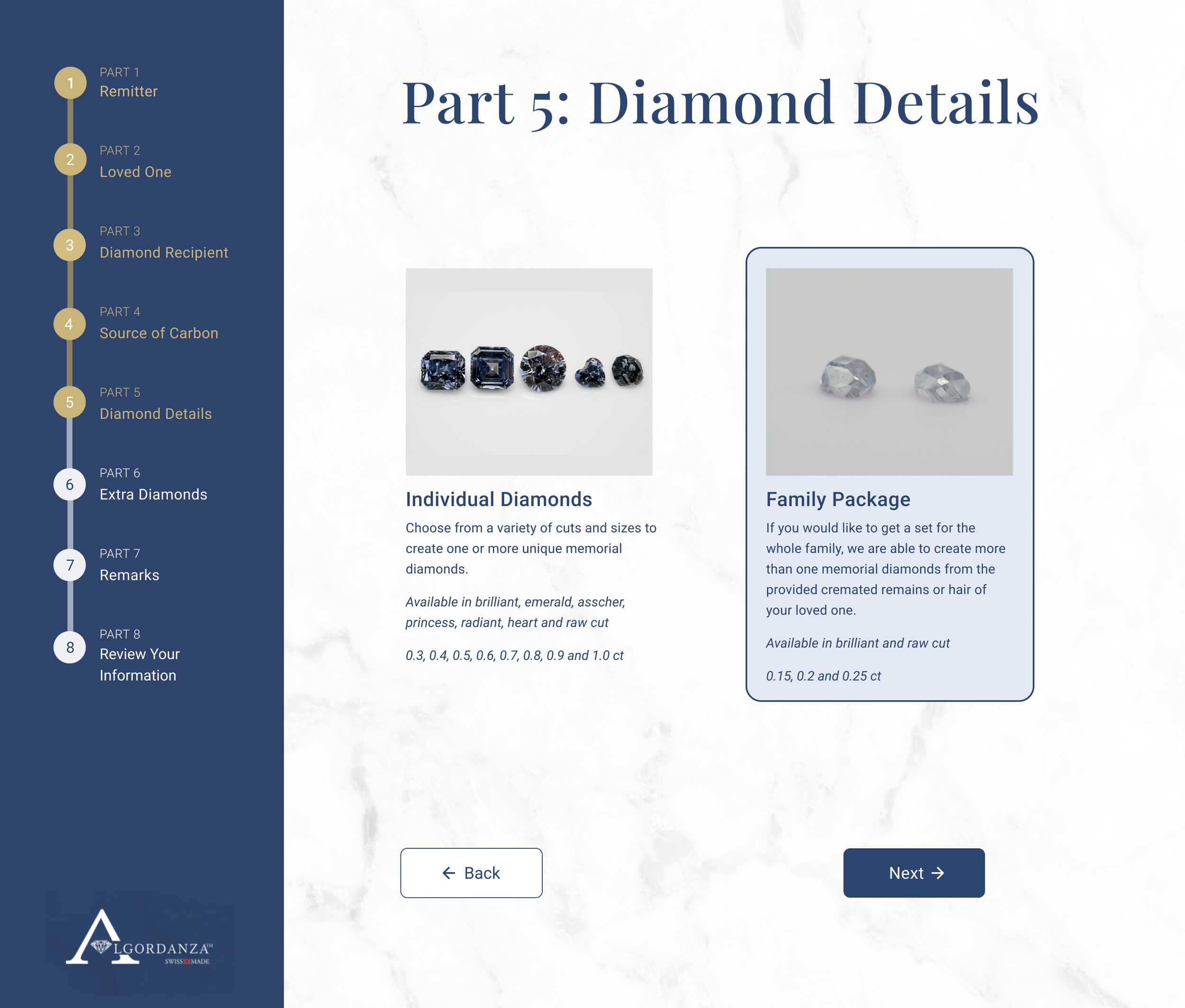
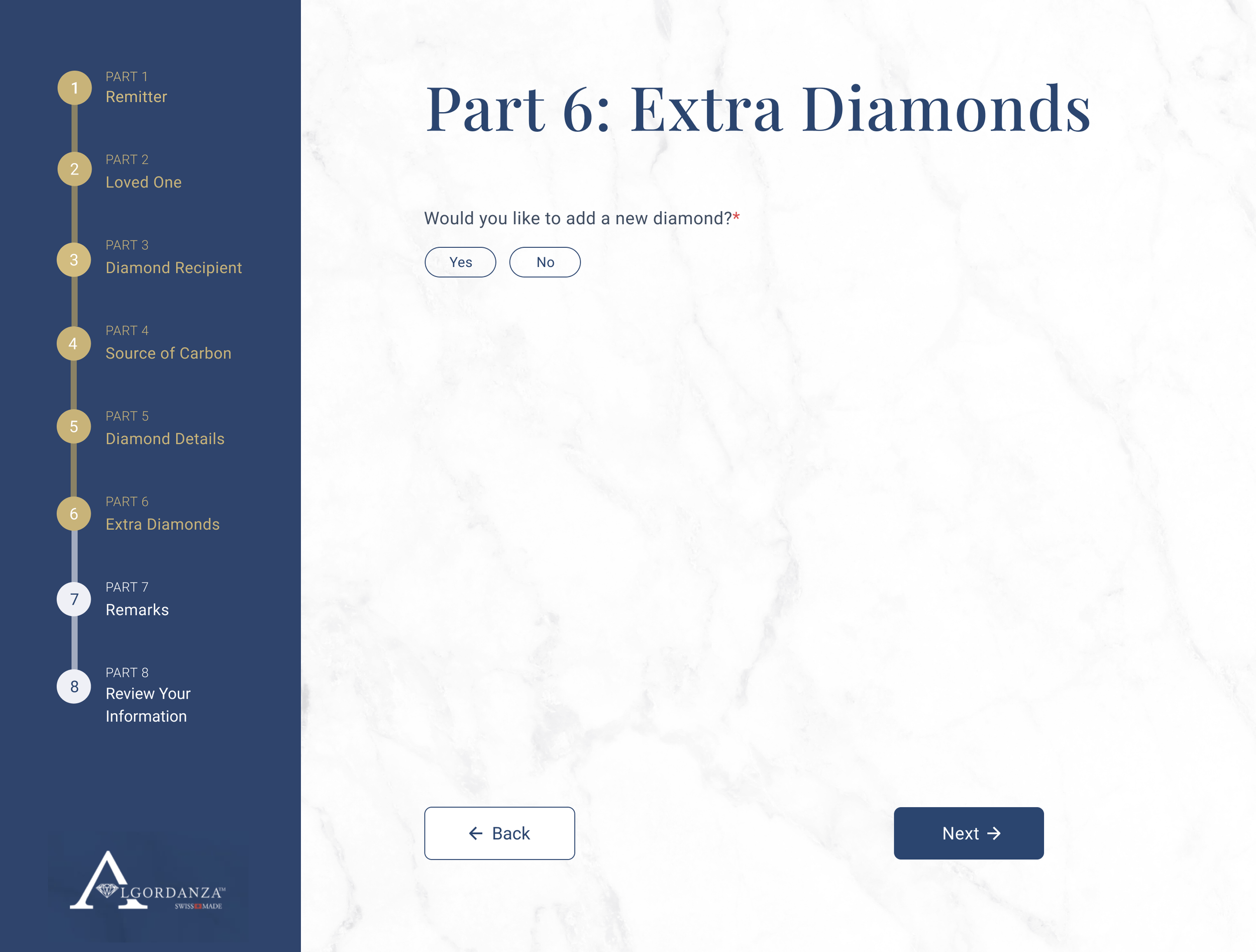
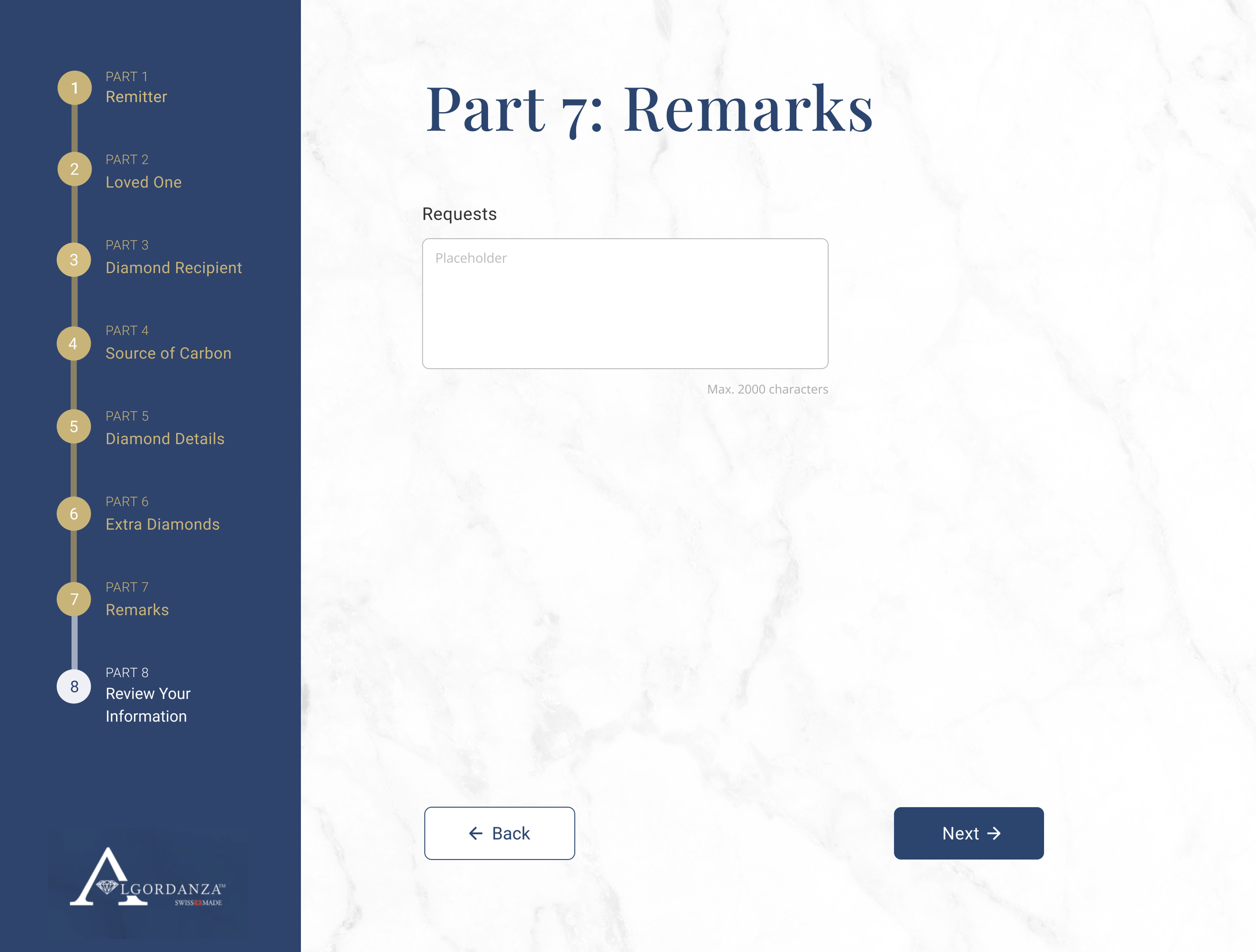
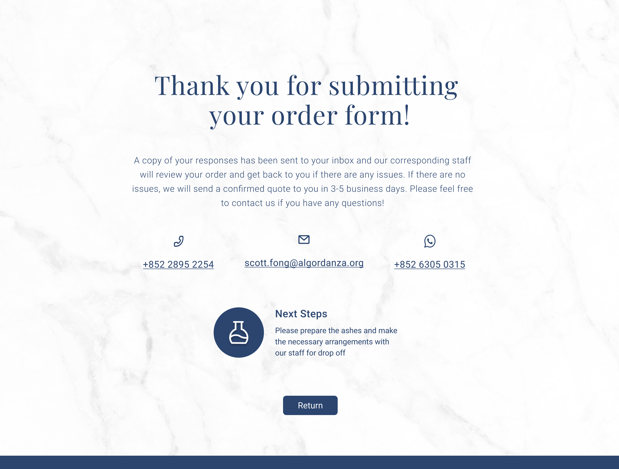
The main objective was to create a clear and easily readable form, making things easy for customers and not overwhelm them with information. The original form was also broken down into different sections, so it was easy to translate it into a multi-step form. Since the form is quite long, we also wanted users to be able to freely go back to previous sections, so we added a progress bar. We also decided to provide a summary of all the questions and answers at the very end, so users can check their information and edit it if needed before submitting.
I decided to have the progress bar on the side instead of the top, to prevent the page from getting too long and having too much empty space on the sides. I also decided to make use of the brand colors to highlight the progress bar and add a slight texture to the background to make it more comfortable on the eyes and make the form look more branded. Adding some elements of color also helped break down the monotony of the content and we wanted it to feel comfortable and in line with Algordanza’s other branding.
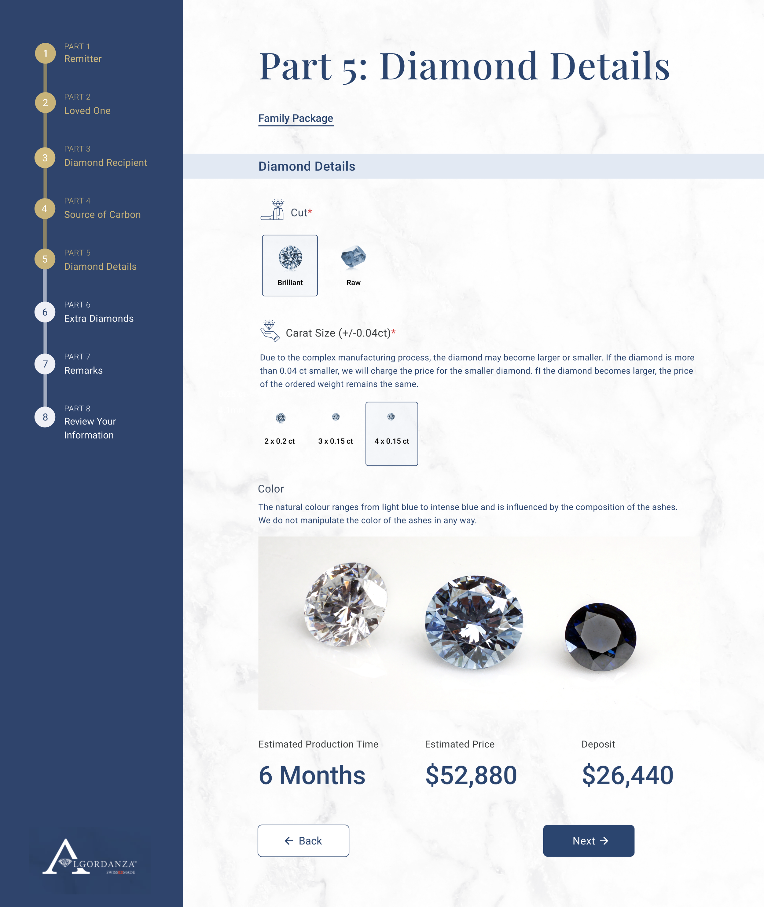
Taking into consideration the side bar and the fields themselves, I then had to figure out how to fit all the content while keeping the layout and spacing consistent. So we laid out the images for the Carat Size and Cut first to see how we could fit it in one row and worked backwards from there, setting up a grid and adjusting some content spacing as on some pages, the number of fields would differ and we wanted to avoid inconsistent layouts and balance the negative space, so it’s not too empty or overwhelming.
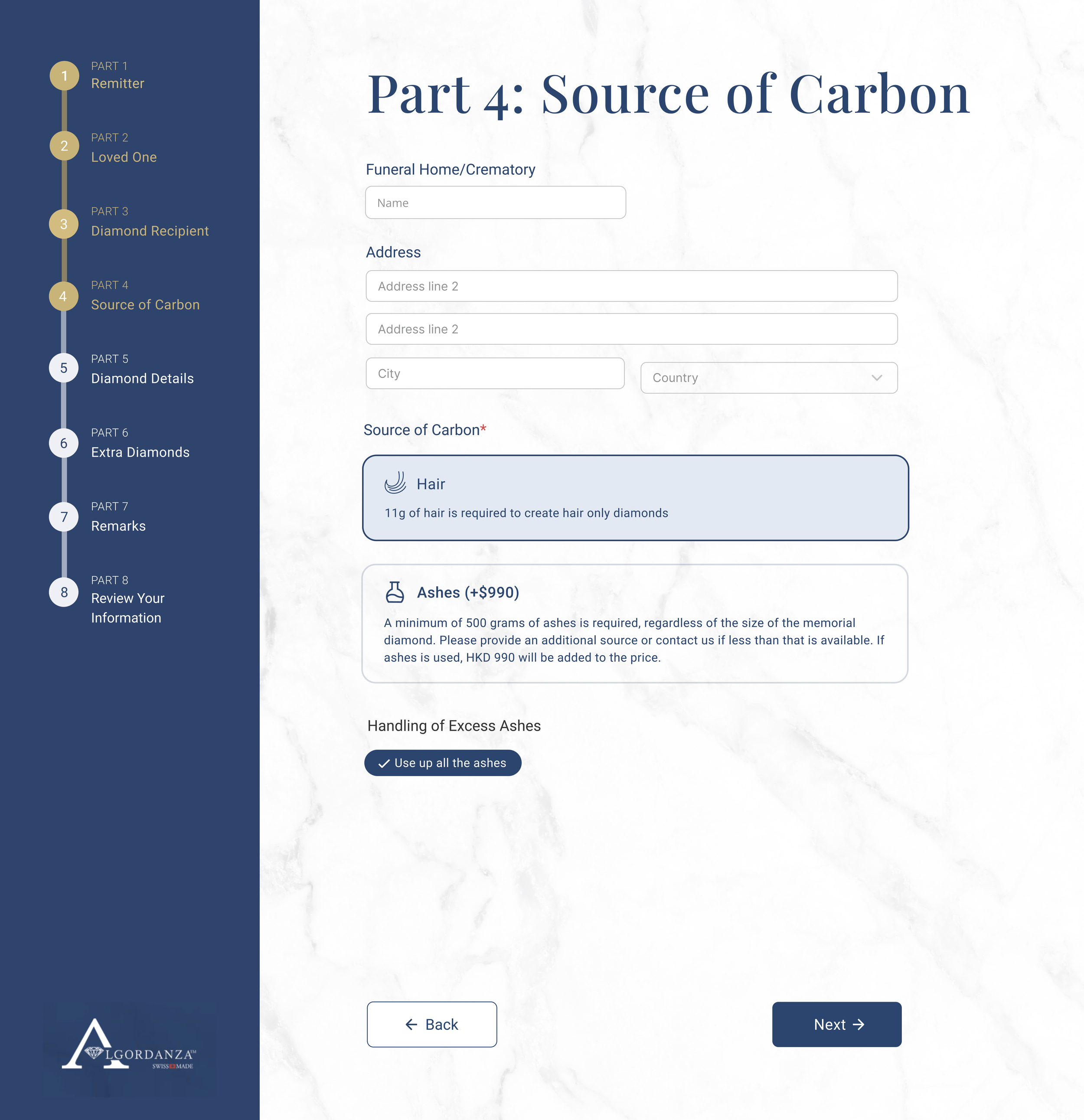
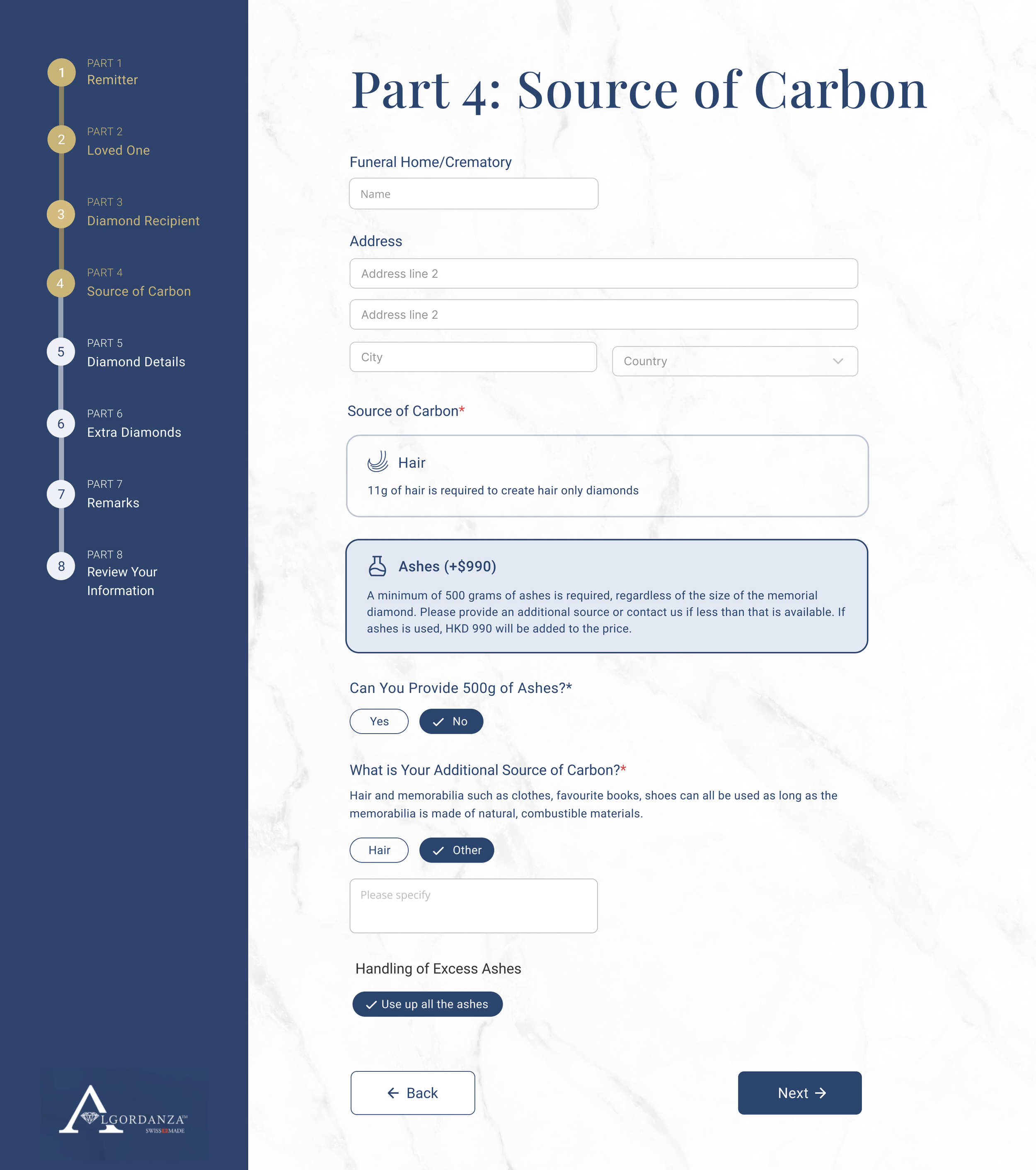
The biggest challenge was thinking about how to design the conditional options and the different user flows for different choices. For example, with the source of carbon for Loved Ones, since it directly affected the diamond’s pricing and required managing conditional options. If the customer had less than 500g of ashes, then they would be required to supplement it with an extra source of carbon. There was also the hair options to create hair only diamonds. We initially tried out using a sliding bar for the weight of ashes, but after a few rounds of iteration, ended up deciding to simplify it by just asking the customer what type of source they wanted to use and if it was ashes, did they have enough and if not, what is their additional source. By removing the quantity input, it would make it easier on the back end as well. We also had to think about what would happen if multiple diamonds were selected and design for that accordingly. The source of carbon was also different for the Loved Ones and Pet form, so the design had to be changed as well.
We then worked on the mobile design, where the biggest challenge was integrating the progress bar in a readable and digestible manner that did not take up too much of the screen, yet was still clickable for the customer.