
Honest Grace Legal Website Redesign & CMS Migration
The Problem:
Honest Grace Legal (HGL) is an Australian law firm specialising in personal injury, family law, and migration law. Clarity and trust is vital for potential clients, but their existing website was visually outdated and plain, creating unnecessary friction. Critical information about fees and services was missing, while lengthy inquiry forms were intimidating. The site was also built on a static platform with no CRM integration, making marketing automation impossible. To remain competitive and attract more clients, HGL needed a better digital presence and system.
The Solution:
1. Do a full-scale redesign of their website to make it more engaging, improving on the content, structure and visuals
2. Migrate their website to Hubspot, unifying marketing, sales, and service under one platform
3. Equip the HGL team with the tools and knowledge to update and maintain the site independently in the future
Timeline:
Nov 2024 - March 2025
Role:
Sole UI/UX Designer
Collaborators:
Development Team, Project and Marketing Manager
Responsibilities:
Competitive Analysis, UI/UX Design, User Testing, Hubspot CMS Configuration, User Testing, Client Training
Discovery & Research
Before any design work began, I conducted a comprehensive audit of the existing HGL website and analyzed three key competitors in the Australian personal injury and family law space.
I presented these findings to the HGL leadership team, highlighting the gap between their current digital presence and competitor standards.
Key Takeaways:
More CTAs ("Book a Free Consultation" throughout the site)
Live chat / chatbot for preliminary questions
Mega dropdown menu + double layer navigation
Clearer "No Win, No Fee" messaging for personal injury
Detailed process explanations
Free claim check
Specific claim scenarios (Who would need to file and why)
Knowledge base (News and success stories)
Consistent use of brand colors to make website stand out
An "About" page with more information about the firm (E.g. Why us)
Team members profile page (With information like qualifications, areas of practice and languages)
User-friendly and responsive
The main goal of these changes are to build trust through clarity while driving conversions and engagement, by equipping visitors with the right information and creating clear, consistent opportunities for them to get in touch.
Based on these findings and their own desires, the HGL team created a sitemap for us to use in the website.
Sitemap

Design Approach
ReuSable Modules:
While designing the site, there were some platform constraints to take into consideration. The redesigned site would be built on HubSpot using its native drag-and-drop builder. This meant the development team would be custom-coding modules that can be reused based on my Figma designs and not just implementing static pages. This fundamentally shaped our design approach. Since the modules would need to accommodate variable item counts (e.g., different numbers of sub-services, icons), they were designed with scalability and responsiveness as the most important factor. The focus was creating easy reusable modules that would allow HGL's team to expand on and maintain the site by themselves in the future, without ongoing developer support. This was especially important, as they had expressed their desire to keep adding new content to the site and possibly make changes.
Examples of Reusable Modules:
Hero Banner (multiple variants for different pages)
Accordion
Image and Content (different variants)
Icon List
Card Blocks
CTA Banner
use of Templates
Given the scale of the site (multiple practice areas that each have sub-pages, blog posts, resources, and team bios), I created page templates in Figma rather than designing each page individually. Each template was designed as a modular canvas, so sections could be added, removed, or reordered by the client post-launch without breaking visual consistency.
Templates Developed:
Homepage
Service Page
Sub-Service Page
Team Overview
Team Member Profile
Success Stories
Blog page
Contact
About Us
Navigation
The existing navigation consisted of a single-level dropdown menu. However, given that HGL's audience is often navigating stressful situations (injury, family separation, migration uncertainty) and seek clear and comprehensive information to make informed legal decisions, it proved insufficient for the site's depth and complexity. So based on our competitor research and the client’s needs, we decided to implement a double layer navigation system. The primary navigation would be a mega menu with information about service categories and the firm, while the secondary navigation would be for quick-access utility links highlighting priority pages and a search function. Legal clients often arrive with specific, urgent questions and this would allow them to be able to navigate directly to the relevant information they need. We also added a CTA on both navigations—one leading to the Contact page and one directly being a phone call. For the mobile version, we decided to remove the quick links to prevent it from getting too long, only leaving the Contact Us.
Webpage Designs
Visual Design
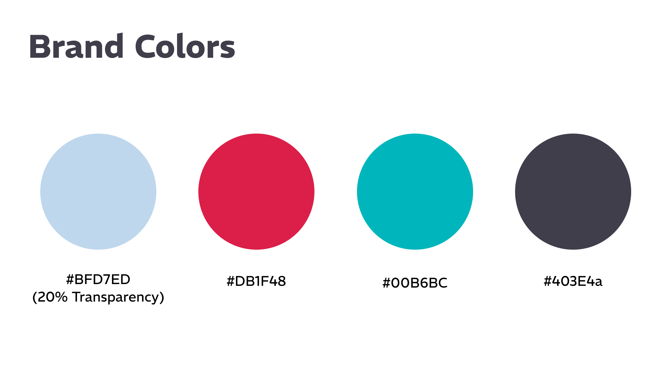
I used HGL's existing brand colors, which are notably bright and welcoming. This, along with the firm's focus on personal injury and family law and their intimate size of their firm led me to go with a more friendly and approachable design, with a strong emphasis on empathy. The goal was to avoid an overtly formal and corporate look, yet still convey credibility and professionalism.
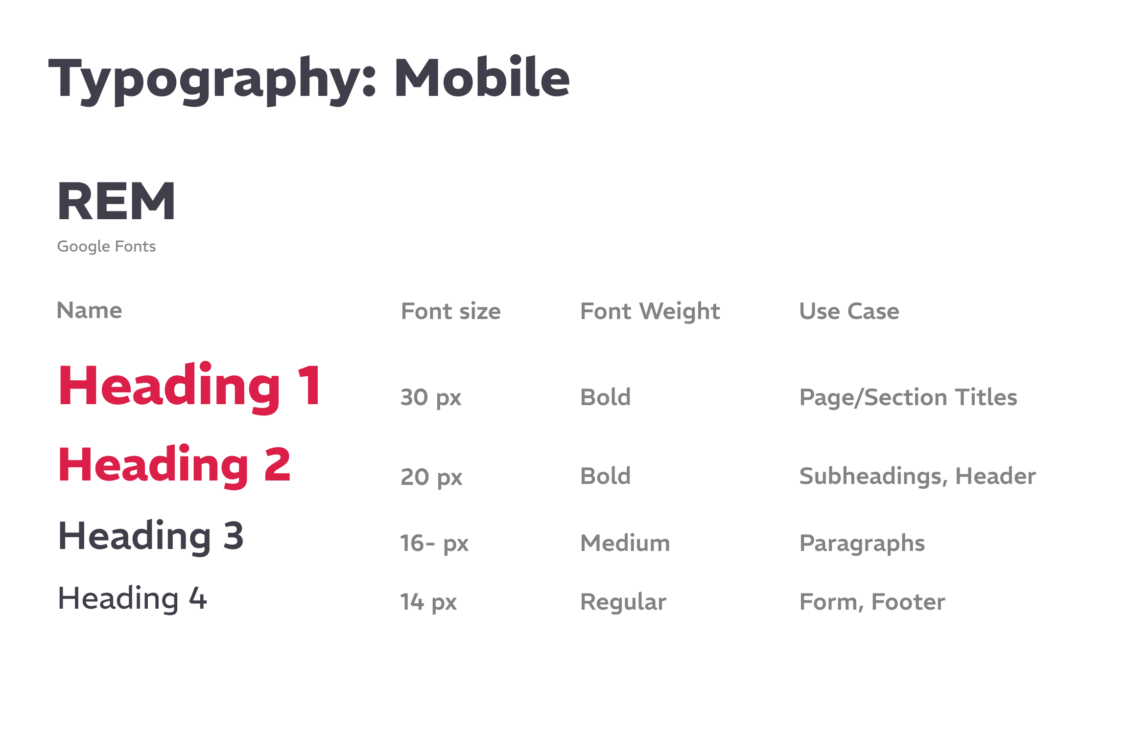
The font I chose also reflected this approach. Rather than using a generic sans-serif like HGL had been using before, I decided to use a modern sans-serif with a warm and comfortable feel while also maintaining excellent readability.
Content strategy
To improve engagement, I utilized strategic CTA placements positioned at natural decision points across most of the pages. I also decided to include the inquiry form on all the pages, so visitors would have easy access to it and not have to specifically go to the contact page. I also incorporated a lot of internal linking throughout the site, connecting related practice areas, success stories, and resources for better SEO practices and to improve information architecture.
The designs for each template were based on the content that the HGL team provided us with, with the assumption that the remaining pages would be following the same content format.
Mobile Design
The desktop version had rich, multi-section content designed to build trust and provide comprehensive information, but HGL did not want the mobile version to be too long to prevent the need for prolonged scrolling.
Their concern was mainly regarding the homepage, so we ended up removing a few sections they deemed to be less important, like the ‘Why Choose Use’, ‘Where Change Begins’ and ‘See Our Success Stories’ on the mobile version.
We also decided to change the service card layout to an accordion style expandable layout, to make it more condensed.
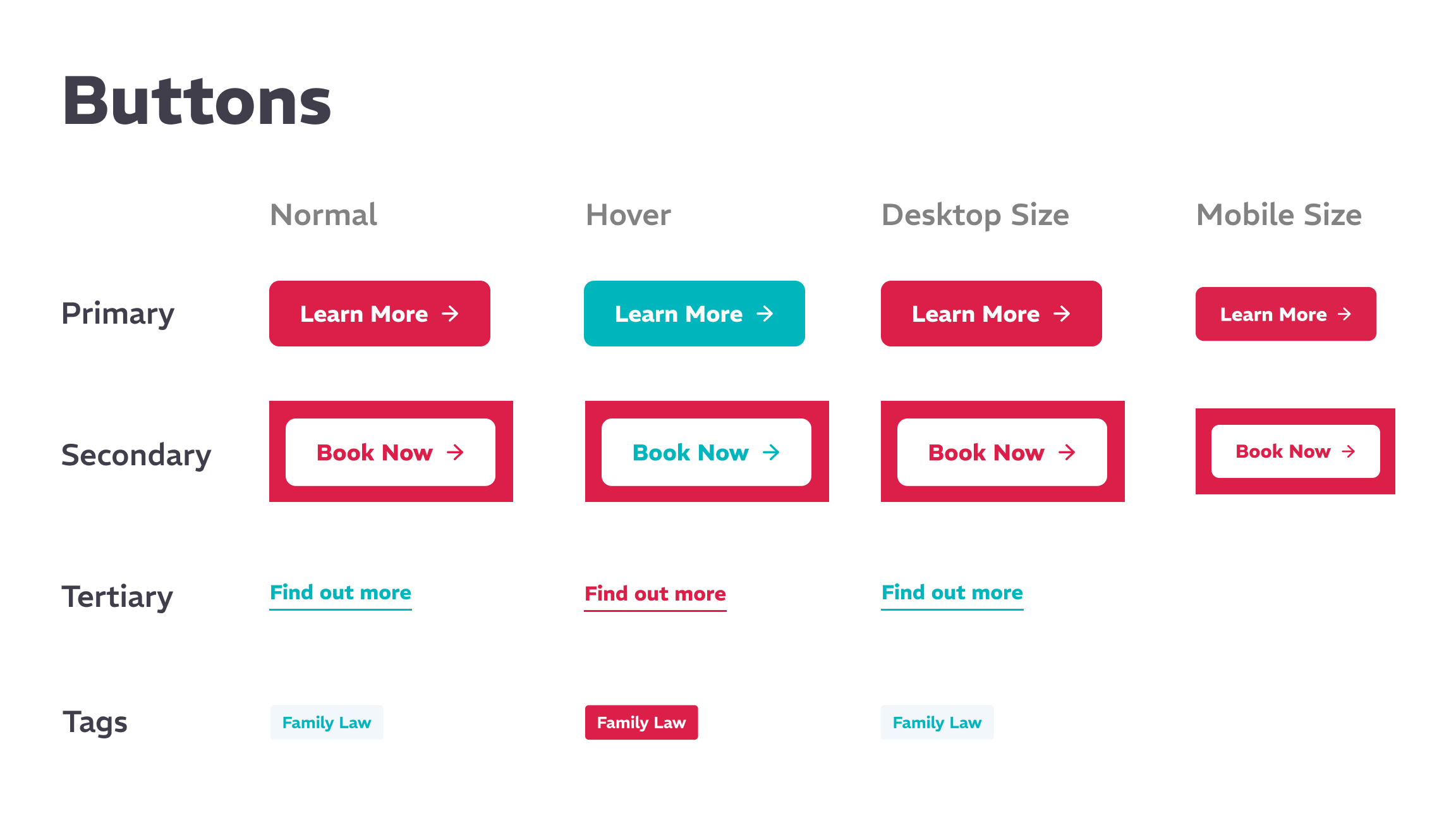
Website Style Guide
Development Handoff
Upon approval of the designs, I created the Website Style Guide and facilitated the handoff of designs and assets to the development team. As the lead designer, I closely collaborated during the development phase, ensuring accurate implementation and conducting rigorous quality assurance testing to meet functional and design requirements.
The developers only implemented the template designs that I created and I was in charge of creating the remaining pages in Hubspot using the CMS Hub. This mainly involved duplicating the template and changing the content. Although we took scalability and responsiveness into consideration as part of the design, throughout this process, we did encounter some spacing issues due to new content and insufficient customization options.
Hubspot CMS
After all the pages were completed, we moved to optimize the website by leveraging Hubspot features for marketing and service needs, including setting up the enquiry form, free claim check, chatbot and smart content. With all of these,
Chatbot
We initially planned to implement a hybrid chat solution, with a live chat staffed by team members during business hours and automatically switching to an automated chatbot after hours. Unfortunately, that ended up not being possible using Hubspot, so we pivoted to just using a chatbot, setting up a chat flow with quick reply options based on the inquiry form. However it was a simplified version with fewer fields, designed specifically to encourage users who may be overwhelmed by the length of the form to share their questions and concerns, allowing for HGL to collect prospect information. Assigned team members would respond to all chat inquiries within 24 hours, hopefully capturing more leads.
smart content
We implemented HubSpot's smart content functionality to dynamically personalize the homepage header based on traffic source. For Example: A visitor arriving via a HGL Family Law Google Ads campaign would see targeted header copy relevant to family legal needs—rather than generic homepage messaging or injury law messaging.
Migration & Launch
After all the pages were completed, we conducted a UAT internally and then with the HGL team, testing all pages and features in both desktop and mobile before migrating the existing pages, setting up page redirects and configuring the domain and SSL to officially launch the site.
To end the project, I led multiple training sessions in Hubspot to teach the HGL team how to independently update and maintain the website without needing developer support and how to leverage Hubspot features to enhance their marketing and service operations.
Results and Conclusions
Ultimately, the core objective of this project wasn't just about launching a new website, but positioning HGL for sustainable, long-term success. Since launch, HGL has consistently published blogs, new updates and content and even began conducted their own A/B testing to make changes. The HubSpot migration has also transformed their operations, enabling optimized lead qualification, streamlining pipeline management and providing real-time performance insights. The result is a more efficient team, faster response times and actionable insights that drive continuous improvement.