
GL-INet Website Redesign
The Problem
GL-iNet is a leading manufacturer of OpenWrt-powered networking devices worldwide. Serving both B2C and B2B markets, their products bridge the gap between consumer convenience and professional-grade.
Despite their technical strengths, GL-INet’s digital presence wasn't keeping pace with their products. Both their ecommerce store and brand site suffered from inconsistent design, poor mobile optimization, and fragmented user experiences. Their existing Shopify theme also lacked various features, forcing reliance on multiple overlapping apps.
The Solution
The goal was to revamp both the brand site and the e-commerce store by creating comprehensive, high-fidelity designs for each platform, unifying the visual identity and elevating GL.iNet's digital presence. The aim was to deliver a responsive, cohesive and optimized experience for both B2B and B2C audiences while simultaneously strengthening community engagement and building greater brand credibility.
Timeline:
June 2025 - November 2025
Role:
Lead Designer
Responsibilites:
UI/UX Design
Research and Discovery
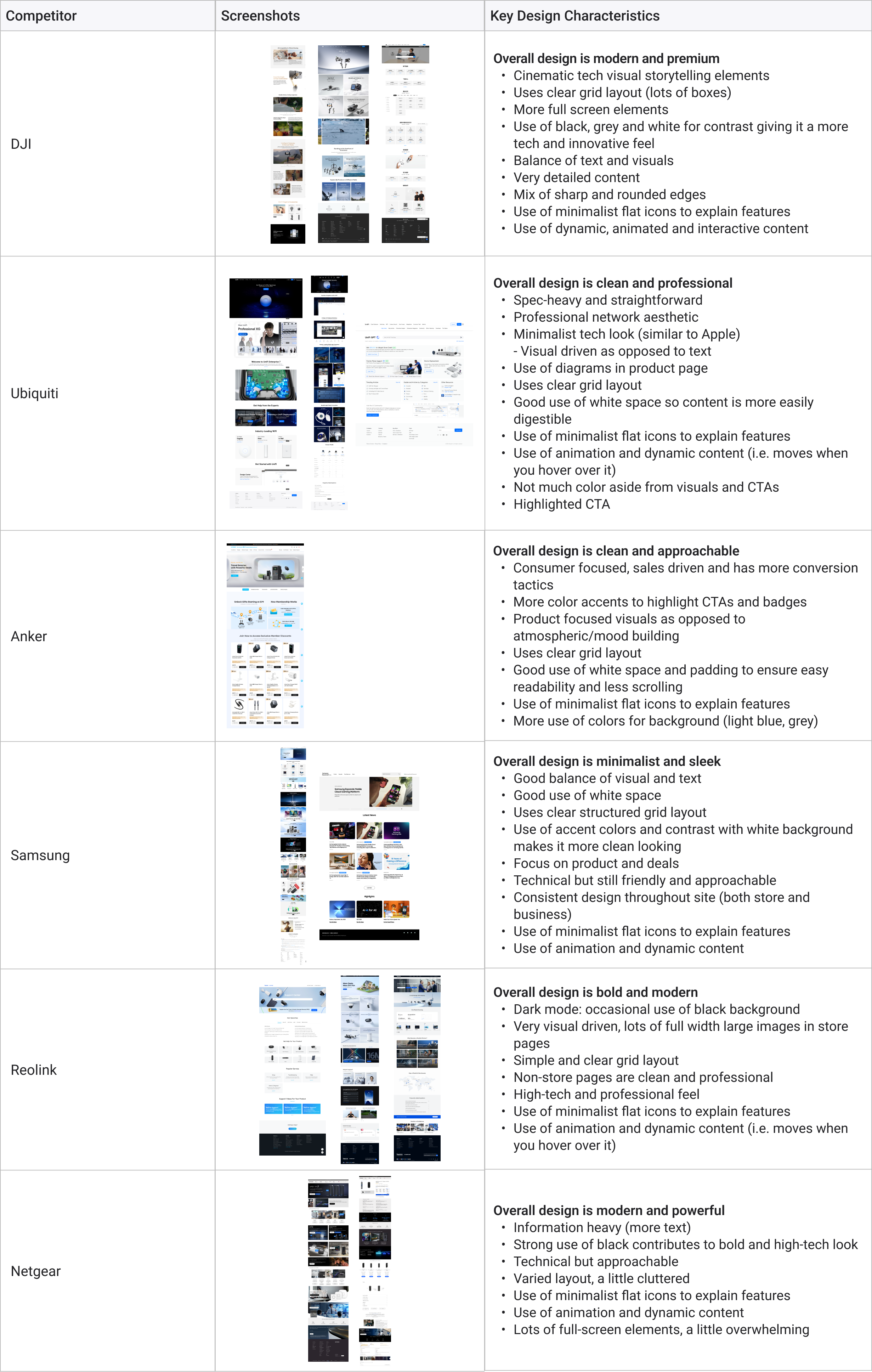
The project began with a comprehensive onboarding form and kickoff call to understand the brand, goals, and desired website features. This was followed by an extensive website audit and competitor research to identify areas for improvement and new features.
Target Audience:
Western men aged 25-34, followed by 35-44
Prosumers (between consumer and professional) and tech-savvy
They are rational and research-driven
They value hard data (specs and performance) over flashy marketing
They want transparency, quick access to documentation and forums, and a streamlined, no-nonsense purchasing process.
competitor Research
Website Audit
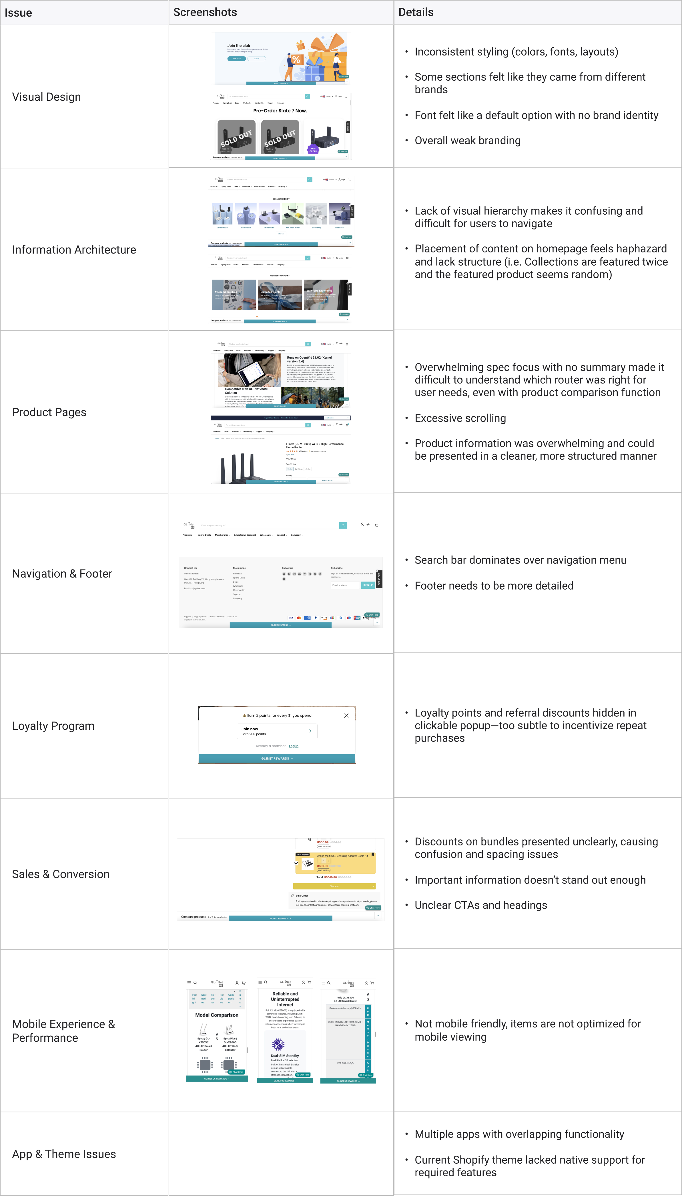
Key Takeaways
Based on research, audit findings, and audience needs, I identified the following features we wanted to focus on for the site redesign.
Visual Clarity:
Clean, minimal and sleek
Modular grid system with organized, scannable sections
Above-the-fold optimization: first section sized and spaced so users see key information without scrolling
Conversion-Optimized (Ecommerce):
Promo plugins and offers (discount pop-ups, countdown timers)
Sale badges (i.e. Hot, New)
Product status tags (Pre-order / Out of Stock / Shipping ETA / Best Seller)
Bulk pricing tiers (e.g., 5+ routers = 15% off).
Upsells (i.e. "Frequently Bought Together" prompts (e.g., router + antennas) and Bundles)
Product comparison tables
Sticky cart
Loyalty Program (points earned per purchase)
Transparency/Trust:
Reviews/Testimonials/Real world use cases
Benchmarks
User-generated Content (Youtube)
Documentation (Quick links to OpenWrt guides)
Trust Badges (I.e. "Enterprise-Grade Warranty")
Theme & App Evaluations
GL-INet provided us with a list of requests and desired features for the new sites. Many of these features were not available in their current Shopify theme. Therefore, we began by researching and exploring alternative themes that could better accommodate their needs.
However, after some discussion, GL-iNet decided to keep their existing Shopify theme and have their developers custom-code the design instead. This was partially because their brand site—which is not hosted on Shopify—would also require custom development. So I would use Figma to design both the brand site and the e-commerce site before handing off the designs to their developers.
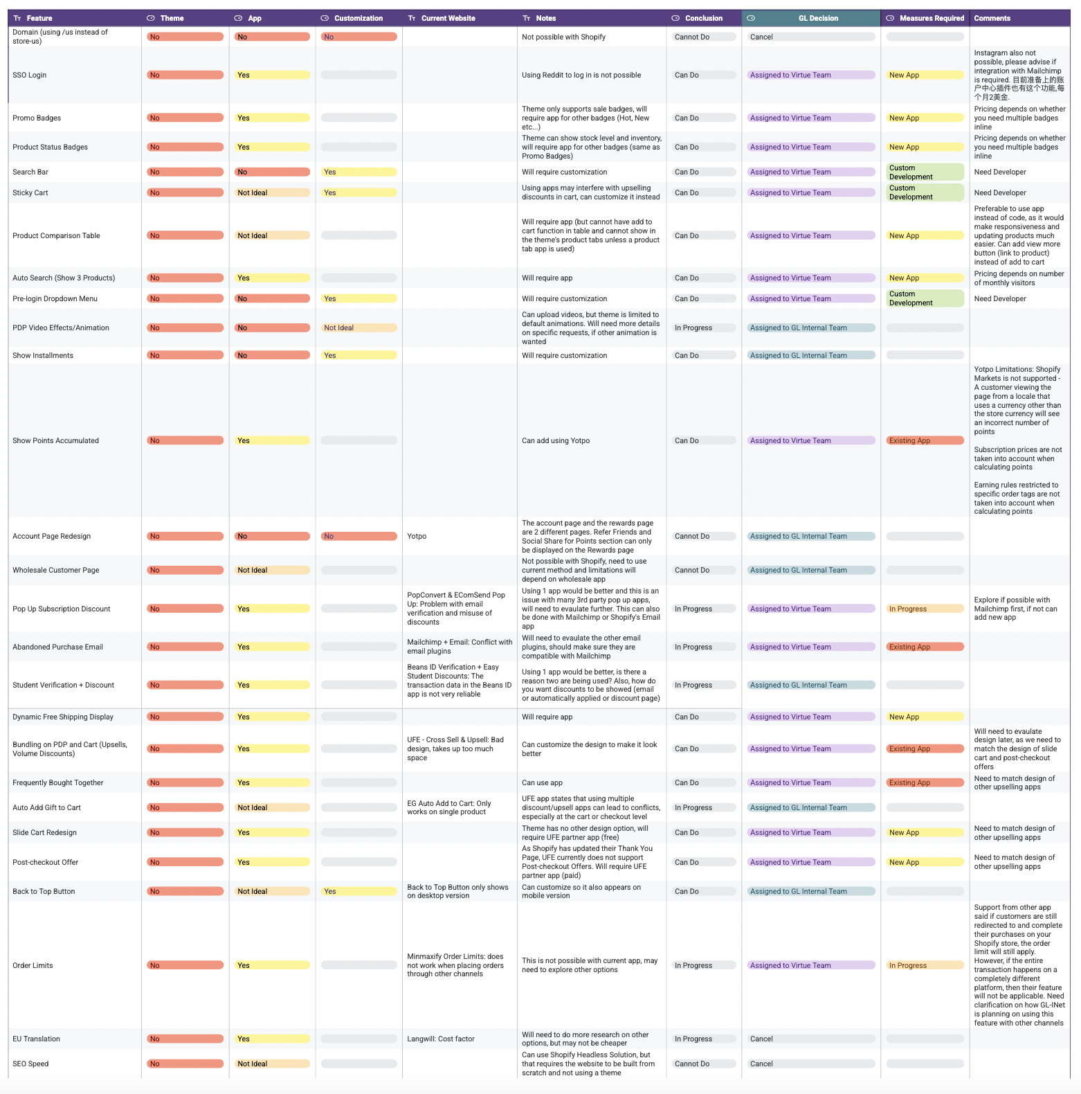
Additionally, they wanted to reduce the number of external apps they were using, as several had overlapping functionalities. They shared a list of their existing apps, and we sought to consolidate or find better alternatives for them.
This presented a major challenge as we had to conduct extensive research on app functionality while considering design constraints to ensure that all apps could integrate harmoniously and maintain visual consistency across the site.
E-commerce Store Site
Their existing website was outdated, generic, and not optimized for mobile devices. It lacked the consistent e-commerce features necessary to drive sales and the content felt a little disorganized. The visual identity was particularly inconsistent across the site. Our goal was to create a more engaging, seamless shopping experience that addressed these shortcomings.

To begin with, we compiled a complete list of all pages that needed to be redesigned, which allowed us to identify the type of changes needed for each and determine whether the design would be based on the existing Shopify theme or depend on particular apps
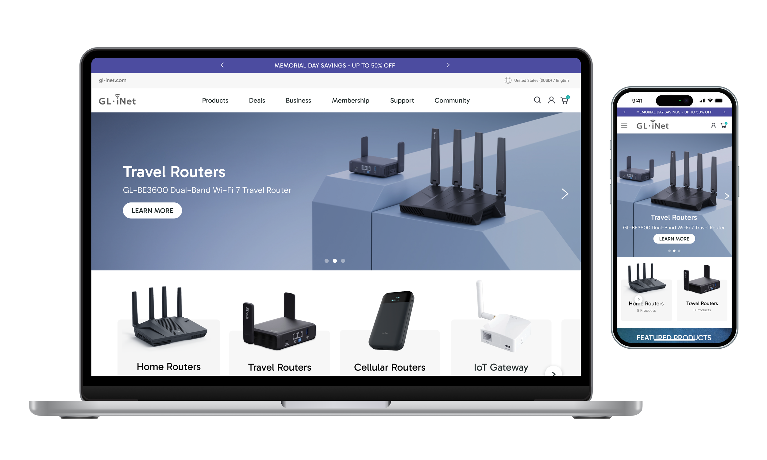
Desktop
The prototype I created for GL-INet also includes some interactive and animated elements, including the navigation and hover effects.
Mobile
Primary Focus:
The e-commerce site is designed to drive direct sales to consumers (B2C) and facilitate wholesale purchases (B2B). So we focused primarily on conversion driven strategies and design, including upselling tactics, such as bundling, product suggestions, post-checkout offers and loyalty program benefits.
The design is also constrained by Shopify's native features (cart, checkout, product templates) and we had to work within those limitations for any customization. This meant having to do a lot of research to figure out how to incorporate our GL-INet’s desired features using third-party apps while working within Shopify’s design limitations and features.
We also wanted to solidify the branding and style guide, which would carry over to the brand site.
Design Process:
We began with the e-commerce site because it was the simpler of the two. Most of its pages already had existing content and required only redesigns, whereas the brand site needed entirely new pages and content.
The tight timeline forced us to be efficient, so I opted to skip wireframes entirely and went straight into creating high-fidelity interactive prototypes in Figma.
I began with the desktop versions and worked in batches of 6 pages. After the overall design was confirmed after the first round of revisions, I would create the mobile design in tangent with the desktop design. Then there would be the second and third round of revisions, before the designs were finalized and I could move to the next batch.
In total, I designed 18 pages—some which would serve as templates for GL-INet to reference (i.e. product page and feature deal page).
Brand Site
Visually, the brand site was a little generic, lacking the modern and sleek tech aesthetic. Similar to the e-commerce site, it lacked consistent page templates and visual consistency, making the user experience feel disjointed. It was also missing some key B2B features and content and had weak community and social engagement features, which GL-INet wanted to strengthen.
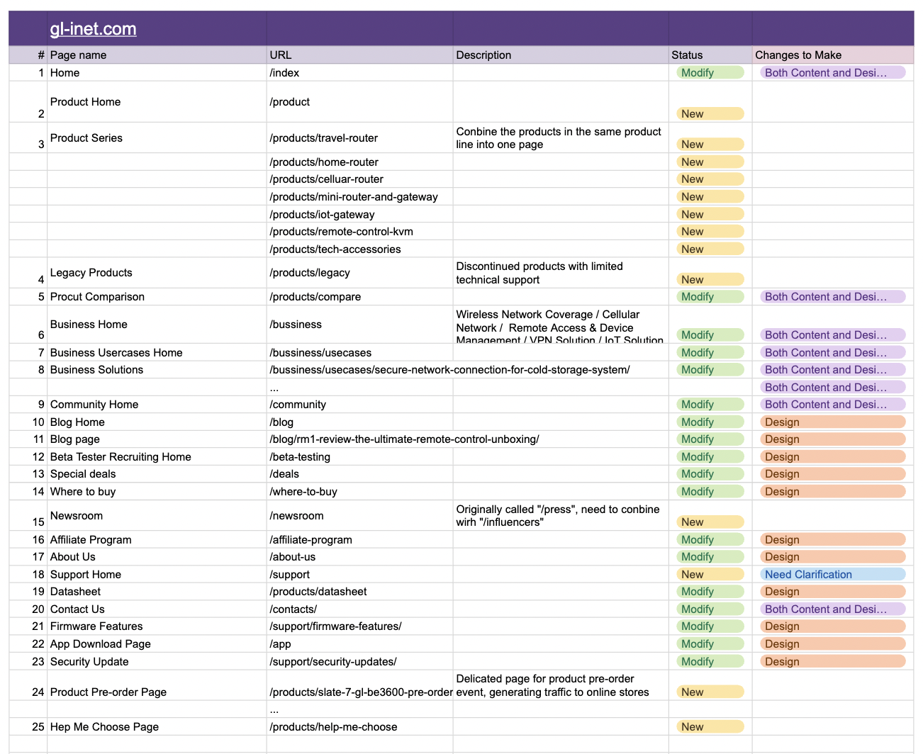
To begin with, we compiled a complete list of all pages that needed to be designed, which allowed us to identify the type of changes needed for each and whether they are completely new pages or based on an existing page.
Desktop
The prototype I created for GL-INet also includes some interactive and animated elements, including the navigation, hover effects and clickable states.
Mobile
Primary Focus:
For the brand site, the main goal was to attract and inform B2B clients (businesses, partners, and technical professionals) about its enterprise solutions while also showcasing its consumer products and building a better community/support access hub.
Compared to the e-commerce site, there was greater freedom of design due to the focus on branding/storytelling rather than conversion-optimized designs. It can also be more dynamic and visually rich, as it is not constrained by templates since it is custom-coded and not built on Shopify.
Design Process:
There was a lot more changes to the brand site than the e-commerce site. Rather than just redesigning current pages and using existing content, we had to combine some pages and suggest new content to improve on the user experience.
Like the e-commerce site, I skipped the wireframes and went straight into creating high-fidelity interactive prototypes in Figma. I began with the desktop versions and worked in batches of 9-10 pages. After the overall design was confirmed after the first round of revisions, I would create the mobile design in tangent with the desktop design. Then there would be the second and third round of revisions, before the designs were finalized and I could move to the next batch.
In total, I designed 30 pages—some which would serve as templates for GL-INet to reference (i.e. business solution and use case detail).
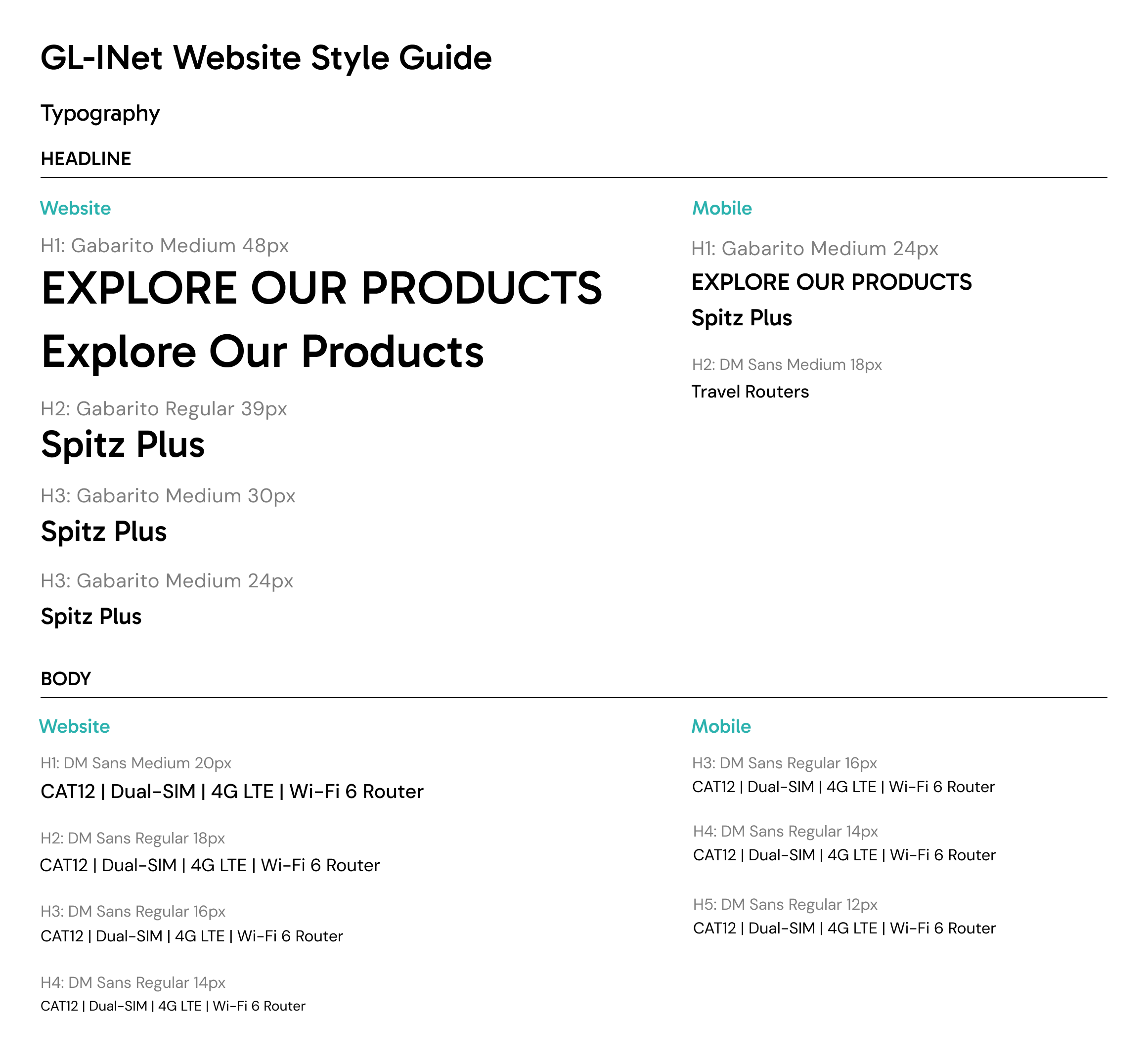
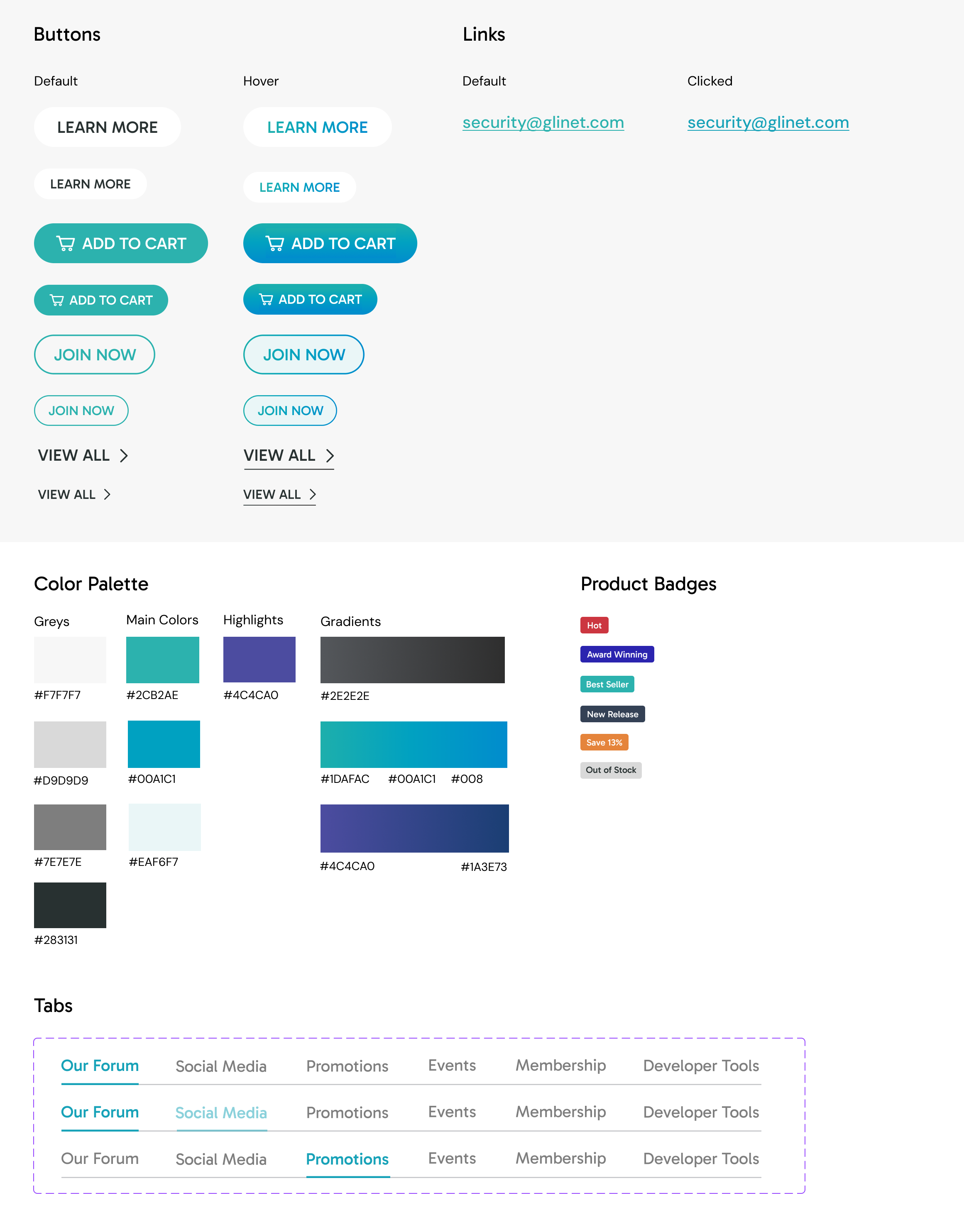
Website Style Guide
Reflections and Handoff
Design Handoff:
After all designs were confirmed, I handed the complete Figma files over to GL-iNet's development team for implementation according to their internal processes, marking the end of my role in this project.
While I worked closely with the GL-INet team—including developers, product managers, and other stakeholders, the final designs were conceived as the most ideal version, not necessarily the exact final version. They wanted us to create this, so they could try to implement as much as they could on their current site. So without access to their Shopify backend or the ability to fully test third-party apps, I did my best to account for the limitations of both the apps and the existing theme. However, the development team may still encounter implementation challenges or run into things they want to change when scaling up the templates.
Challenges:
One of the major challenges in this project was balancing stakeholder desires against optimal user experience. For example, stakeholders often wanted designs that differed drastically from their current site, which made it difficult to maintain a balanced approach. My goal was to create the most effective design, not to change elements arbitrarily just for the sake of change. To address this, I created multiple design options for stakeholders to compare, which allowed them to see trade-offs visually and make informed decisions rather than debating abstract preferences.
Another recurring challenge was that stakeholders would sometimes provide a dynamic and visually interesting reference, yet ultimately prefer a plainer, simpler layouts to make content easier to read and minimizing clicks or scrolling. Walking this fine line was difficult, as I aimed to keep the designs modern and distinctive without becoming generic.
Limitations & Future Improvements:
I conducted extensive research, analyzing competitors and gathering reference materials to support my design decisions. However, due to the project's tight timeline and the client's prioritization of speed, it was not possible to conduct user testing. Ideally, I would have liked to gather data to further validate and back up my design decisions, a step that would have strengthened the final outcome and potentially reduced some of the friction around competing preferences.